How to Mix and Match Blocks for Custom Page Layouts

Stop designing from scratch every time. Learn how smart block combinations can help you build faster, look better, and launch sooner without writing a single line of code.
Every great website is really just a collection of well-placed blocks: a hero here, a services section there, a testimonial strip, a footer. The secret to building pages that look custom and high-end isn’t starting from zero. It’s knowing which blocks to combine, and how.
In this guide, we’ll walk you through the art of mixing and matching content blocks to create pages that feel fully bespoke even when they’re built in minutes using Elementor.
68% of users form an opinion about a website in under 50 milliseconds.
That means your page layout the arrangement and visual weight of blocks is doing most of the heavy lifting before a single word is read.
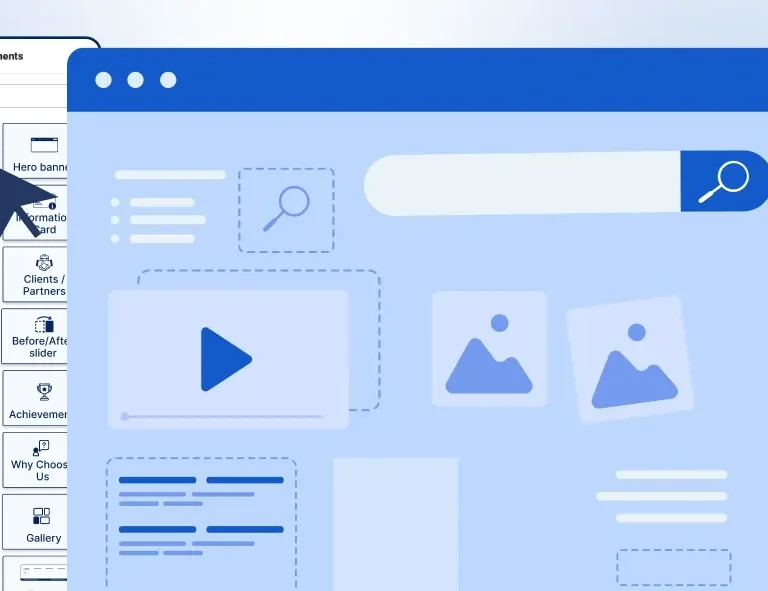
What Are Page Blocks, Exactly?
In the context of Elementor and page builders like it, a block is a self-contained section of content that serves a single, clear purpose. Think of them like LEGO bricks — each one is designed individually, but the real magic happens when you assemble them together with intention.
Common block types include:
- Hero Blocks — The first thing visitors see. Sets the tone and communicates the core value proposition.
- Service Blocks — Showcase what you offer using icons, descriptions, and clean layout grids.
- Testimonial Blocks — Display social proof from real clients in stylish card layouts.
- Blog Post Blocks — Automatically pull recent posts in grid or list format.
- Callout / CTA Blocks — High-impact banners that drive action at key scroll points.
- Header & Footer Blocks — Global navigation and brand-consistent footer design.
- Content Blocks — Flexible sections for mixed content: text, images, and icons together.
| Quick Fact
The average landing page contains between 5 and 9 distinct content sections. Knowing how to order and style those sections is what separates a professional site from a generic one. |
Why Mixing and Matching Works
Many creators make one of two mistakes: they either use the same layout template for every page (boring and inflexible), or they try to design everything from scratch every time (exhausting and slow).
The sweet spot is in between: start with proven block types and combine them in ways that reflect your content goals. This is exactly what professional web designers and agencies do: they maintain a library of reusable components and remix them per project.
“Design is not just what it looks like and feels like. Design is how it works.”
— Steve Jobs, Co-Founder, Apple Inc.
The same principle applies here. It’s not enough for each block to look good individually. The way they work together the rhythm, spacing, flow, and contrast between sections is what creates a truly well-designed page.
Did You Know?
Companies that use modular design systems (reusable UI blocks and components) report up to 40% faster page delivery on client projects. OneClickBlocks gives freelancers and agencies this exact advantage a ready-made block library inside Elementor.
| Page Type | Recommended Block Order | Key Conversion Block | Complexity |
| Landing Page | Hero → Services → Testimonials → CTA |
CTA Block | Simple |
| Homepage | Hero → Services → Blog Posts → Testimonials → Footer |
Hero Block | Medium |
| Services Page | Header → Service Blocks → Callout → Testimonials → CTA |
Service Block | Medium |
| Portfolio / Agency | Hero → Content Blocks → Testimonials → Blog → CTA → Footer |
Content Block | Rich |
| WooCommerce Store | Hero → Service Blocks → Product Sections → Testimonials → Footer |
Product CTA | Medium |
| Blog / Content Site | Header → Hero → Blog Posts Grid → CTA → Footer | Blog Posts Block | Simple |
Step-by-Step: How to Mix Blocks for Any Page
Here’s a practical process any creator can follow, whether you’re building a client site or your own business page.
- Define Your Page Goal First
Every page has one primary job: get a lead, make a sale, explain a service, or build trust. Identify it before you place a single block. This determines which blocks are essential and which are optional. - Start With a Hero Block
The Hero is your first impression. Use it to communicate the core message clearly: what it is, who it’s for, and what to do next. A strong headline + a CTA button is usually enough. - Layer In Supporting Blocks
Add blocks that back up your headline: Service Blocks to explain what you do, Content Blocks to go deeper, and a Testimonial Block to remove doubt. Think of these as answers to unspoken visitor questions. - Break Up the Flow With Callouts
Use Callout Blocks strategically mid-page to re-engage readers who are scrolling. A well-placed “Get a free quote” callout between two content sections keeps momentum going. - Close With a Strong CTA + Footer
End every page with a clear action step. Then anchor it with a professional footer that includes navigation, contact info, and brand details. This is where trust is sealed.
OneClickBlocks Widgets for Every Layer
Here are the key widgets inside OneClickBlocks that map directly to each stage of a well-structured page:
Hero / Header
First impression, bold headlines, CTA ready
Service Blocks
Modern layouts to showcase your services
Testimonials
Real client reviews in stylish layouts
Blog Posts
Grid or list views, fully customizable
Callout Boxes
Eye-catching mid-page attention grabbers
Slider
Responsive image & content carousels
Content Blocks
Pre-designed flexible section layouts
Footer Builder
Custom footers without touching your theme
Pro Tips: Making Your Block Layout Stand Out
- Alternate visual weight — Don’t stack three light sections in a row. Use a dark callout or image-rich block to break the pattern and keep eyes moving.
- Match block count to content depth — A product landing page needs 4–5 focused blocks. An agency homepage can justify 7–9. More isn’t always better.
- Use whitespace as a block — Padding and spacing between blocks is design. Tight blocks feel cheap; generous spacing feels premium.
- Repeat your CTA in 2–3 spots — Place it in the Hero, once mid-page, and once at the end. Different people convert at different scroll depths.
- Make testimonials adjacent to service claims — A claim followed immediately by a testimonial that validates it is far more persuasive than testimonials isolated at the bottom.
- Keep headers and footers global — Use OneClickBlocks’s Header and Footer Builder to maintain brand consistency across every page without rebuilding it each time.
Common Mistakes to Avoid
Even experienced builders fall into these traps:
- Too many blocks with no hierarchy — Every section screaming for attention means none of them stand out. Prioritize.
- Inconsistent spacing between blocks — Different padding on each section creates visual noise. Set a spacing standard and stick to it.
- Forgetting mobile layout — A block that looks great on desktop can collapse badly on mobile. Always preview in Elementor’s responsive mode. OneClickBlocks widgets are built fully responsive by default.
- Skipping the footer block — A missing or lazy footer instantly signals an unfinished site. Invest in a clean footer with navigation, social links, and contact info.
- Using too many plugin add-ons — Loading 6 different Elementor addons for 6 different block types bloats your site and slows load speed. OneClickBlocks replaces them all with one clean plugin.
| Did You Know?
A 1-second delay in page load time can reduce conversions by up to 7% (Akamai Research). Using a lightweight block plugin like OneClickBlocks — instead of stacking multiple heavy addons — directly protects your page speed and your bottom line. |