Best Practices for Building Clean, Mobile-Friendly Pages

A website that looks stunning on a desktop but breaks on a phone isn’t a website; it’s a missed opportunity. With mobile traffic now accounting for the majority of web visits worldwide, mobile-friendliness isn’t a bonus feature. It’s the baseline.
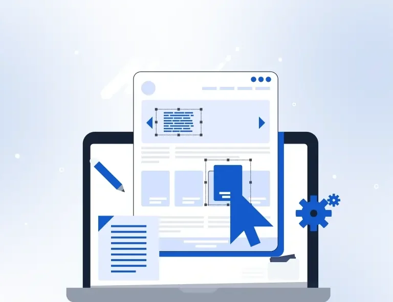
The good news: when you build with ready-made blocks in Elementor using OneClickBlocks, the responsive foundations are already built in. Every widget is designed to adapt across screen sizes. But knowing a few key practices helps you push that further into pages that feel genuinely crafted for mobile, not just technically functional on it.
63% of all web traffic globally now comes from mobile devices
53% of mobile users abandon a page that takes longer than 3 seconds to load
61% of users won’t return to a site they had trouble accessing on mobile
Think Mobile First,
Most people build their Elementor pages in desktop view, then check mobile as an afterthought. Flip this habit. Build in desktop view, but check mobile after every single section you add. Catching a layout problem on Section 3 is a five-second fix. Catching it across all ten sections after you’ve finished is an hour of rework.
Elementor’s responsive preview icons sit at the bottom of the editor panel: phone, tablet, desktop. Make switching between them a reflex, not a final step.
| Did You Know?
Google’s search rankings now use mobile-first indexing, meaning it evaluates and ranks your website based on how it performs on mobile, not desktop. A poor mobile experience doesn’t just lose you visitors; it actively hurts your position in search results. |
The Core Practices Applied
- Use OneClickBlocks widgets; they’re responsive by default.
Every widget in the OneClickBlocks library is built to reflow and restack automatically across breakpoints. This means your Testimonial Widget, Blog Grid, Slider, Service Blocks, and Header all adapt to mobile without any extra configuration. You’re not fighting for responsiveness; you’re starting with it. - Set consistent padding using Elementor’s responsive controls.
Generous desktop padding of 80px top and bottom often feels overwhelming on a 375px phone screen. In Elementor, switch to mobile view and reduce section padding to 40–50px for a cleaner, less cramped layout. Use the Advanced tab on each section to set mobile-specific values without affecting your desktop design. - Size your fonts for thumbs, not cursors.
Body text below 15px becomes uncomfortable to read on mobile without zooming. Headings that work at 60px on desktop often need to drop to 32–38px on mobile to avoid awkward line breaks. Elementor lets you set separate font sizes per breakpoint. Use this on every heading and make sure body text is never below 15px on any device. - Compress every image before uploading.
Uncompressed images are the single biggest cause of slow mobile load times. A 4MB hero image that loads in a second on a broadband connection takes 8–12 seconds on a typical mobile network. Before uploading any image to Elementor, compress it to under 200KB using a free tool like Squoosh or TinyPNG. OneClickBlocks’s widgets display images efficiently but only if the source files are optimised. - Make buttons large enough to tap comfortably.
Google’s tap target guidelines recommend all interactive elements be at least 48×48 pixels on mobile. Small CTA buttons that are easy to click with a mouse become frustrating to tap with a thumb. In Elementor, switch to mobile view and increase button padding to at least 14px vertical / 28px horizontal. Test it with your actual thumb before publishing. - Limit columns to one on small screens.
A three-column services grid looks sharp on desktop. On a 375px phone, three columns squish into unreadable slivers. In Elementor’s column settings, switch to mobile view and change multi-column layouts to a single column. OneClickBlocks’s Service Blocks and feature grids handle this gracefully, but always verify the stacking order makes logical sense when read top to bottom. - Hide non-essential elements on mobile using visibility controls.
Some design flourishes decorative background shapes, wide spacer blocks, secondary image panels add visual richness on desktop but create visual noise on mobile. Elementor’s Advanced tab includes a “Responsive” section where you can hide any element on specific devices. Use it selectively to clean up the mobile experience without removing elements from desktop. - Test on a real device, not just Elementor’s preview.
Elementor’s built-in mobile preview is helpful but not definitive. Browser engines, device pixel ratios, and real-world touch interactions sometimes reveal issues that don’t appear in the editor preview. Before launching any page, open it on at least one real mobile device ideally both an iPhone and an Android and tap through every interactive element. What you find will almost always surprise you.
Quick Fact
According to Portent’s 2024 Site Speed Industry Report, pages that load in 1 second convert 3× better than pages that take 5 seconds. Image compression alone — the single most overlooked mobile practice — can cut load times by 40–60% on most Elementor-built pages.
| “Mobile is not the future, it is the now. Meet your customers in the environment of their choice, not the environment of your convenience.”
— Cyndie Shaffstall, Digital Marketing Author |
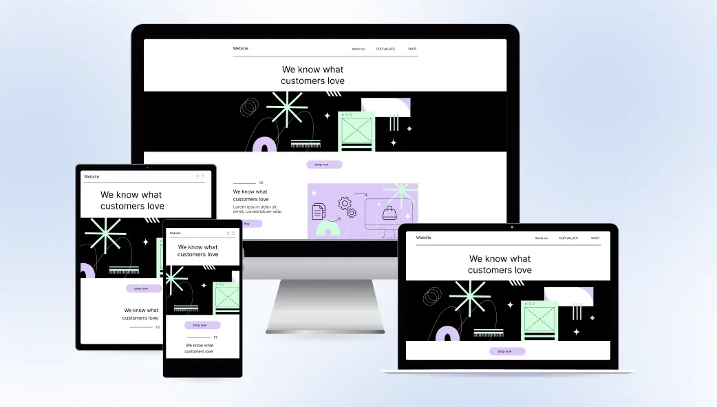
Where OneClickBlocks Fits In
The practices above apply to any Elementor build, but they’re significantly easier to implement when your starting blocks are already responsive. OneClickBlocks widgets are engineered to handle mobile reflow, stacking, and scaling out of the box. You’re not overriding a broken layout; you’re refining an already-solid one.
The Header Builder creates a mobile-friendly navigation that collapses gracefully on small screens. The Testimonial Widget restacks from three columns to one automatically. The Blog Posts Grid adjusts from a multi-column layout to a clean single-column feed. The Footer Builder reflows its link groups cleanly for mobile navigation.
Your job isn’t to make these widgets work on mobile — they already do. Your job is to apply the eight practices above to ensure every custom piece of content you add maintains that same standard. Check after every section. Compress every image. Test on a real phone. Publish with confidence.
| The OneClickBlocks Advantage
Every widget in the OneClickBlocks library Testimonials, Sliders, Service Blocks, Blog Grids, Header Builder, Footer Builder is fully responsive by default. You get clean, mobile-friendly pages from the first block you drop, not the last one you fix. |