Common Mistakes to Avoid When Using Pre-Made Website Blocks

Pre-made blocks are one of the greatest time-savers in modern web design. Drop a section in, customize it to your brand, and move on without rebuilding layouts from scratch every single time. But there’s a gap between using blocks and using them well. A lot of websites built with pre-made blocks still look generic, load slowly, or confuse visitors, not because the blocks are bad, but because of a handful of avoidable mistakes made during implementation.
If you’re building with Elementor and a block aadd-onlike OneClickBlocks, this guide will help you sidestep the most common pitfalls so every page you build is clean, fast, and genuinely effective.
-
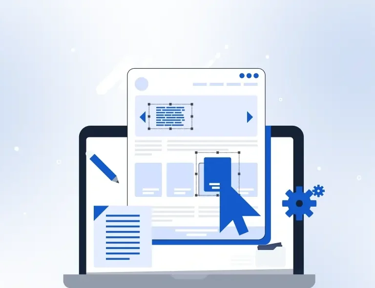
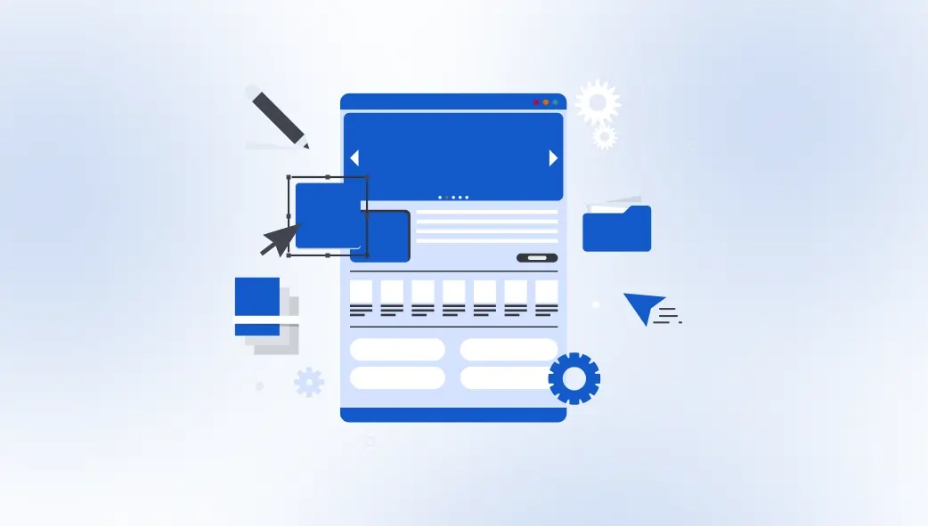
Using Blocks Without Customizing Them
The most widespread mistake is also the most obvious: dropping a pre-made block onto a page and leaving it almost entirely as-is. Placeholder text stays in. Default colors don’t match the brand. Stock images remain untouched. The block looks fine on its own, but it doesn’t look like your website. Visitors notice this disconnect immediately, even if they can’t articulate why. It signals that the site was thrown together rather than crafted, and that erodes trust before you’ve said anything meaningful.
Every block you use should be treated as a starting point, not a finished product. Swap in your brand colors. Replace every line of placeholder copy with real, specific content. Change images to ones that actually relate to your
-
Installing Too Many Block Plugins at Once
Another extremely common trap: installing a separate plugin for every widget you need. A slider plugin here, a testimonials plugin there, a team section plugin somewhere else. It feels logical: each plugin does one thing well. But the cumulative cost is severe. Every additional plugin adds its own CSS and JavaScript to every page load, regardless of whether that page actually uses the widget. Your site gets heavier, slower, and harder to maintain with every plugin you stack.
The smarter approach is to consolidate. A single, selective add-on like OneClickBlocks gives you all the essential widgets Testimonials, Sliders, Headers, Footers, Service Blocks, Blog Grids, Callout in one lightweight package, with the ability to disable individual widgets you’re not using. One plugin. All the blocks. A fraction of the performance cost.
-
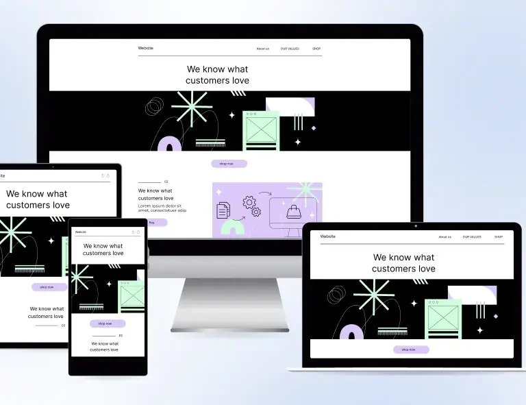
Ignoring Mobile After Building on Desktop
Building a page on desktop and never checking how it looks on mobile is one of the costliest oversights in block-based design. Pre-made blocks are built to be responsive, but they still require your attention on mobile, especially after you’ve customized them. Custom font sizes, adjusted padding, wide images, and multi-column layouts can all break or look awkward on smaller screens in ways that Elementor’s default responsive behavior doesn’t automatically fix.
Make it a rule: every page gets reviewed in Elementor’s mobile and tablet preview before it goes live. Check that text is readable without zooming, buttons are large enough to tap, and no content is getting clipped or overlapping. OneClickBlocks’s widgets are built with mobile-first responsiveness, but your customizations still need a mobile eye.
-
Mixing Too Many Block Styles on One Page
Pre-made blocks come in many visual styles: different card treatments, different spacing systems, different border radii. When you pull blocks from too many different design families onto the same page, the result is visual chaos. Each section looks fine on its own but clashes with what’s above and below it. The page feels assembled rather than designed.Stick to a consistent visual language. Choose blocks that share similar structural characteristics: similar card styles, similar spacing proportions, similar typographic weights. The goal is for a visitor to scroll down your page and feel like every section was built by the same hand, for the same brand. Consistency is what makes a page feel professional.
-
Placing Blocks Without Thinking About Page Flow
Blocks are tools, not a strategy. Dropping them onto a page in a random order — hero, then pricing, then an about section, then a testimonial without thinking about the logical journey of a first-time visitor is one of the subtler but most damaging mistakes you can make. Every section on a page should earn its position by serving a specific purpose in the visitor’s decision-making process.
Think in terms of narrative. Your hero introduces the promise. Your feature or service blocks substantiate it. Your testimonials validate it. Your CTA block captures it. When blocks are sequenced with that logic in mind, the page reads like a persuasive story. When they’re scattered without intention, the page reads like a brochure informative, perhaps, but not compelling.
Final Word: Blocks Are a Starting Point — Not a Shortcut
Pre-made blocks are genuinely powerful when used with intention. They compress hours of layout work into minutes and give you a professional structural foundation for every section of every page. But they are a starting point, not a finished website. The designers and creators who get the most out of them are the ones who treat each block as raw material, deliberately customizing it, maintaining visual consistency, checking every breakpoint, and sequencing sections with the visitor’s journey in mind.
Avoid the mistakes in this guide, and your block-built pages will feel indistinguishable from custom-designed ones. That’s the real power of working with a focused, well-built tool like OneClickBlocks inside Elementor: you get the speed of templates with the quality of intentional design.