10 Essential Website Sections You Can Build Using Pre-Made Blocks

Every professional website is built from the same core sections. Here’s your complete guide to each one: what it does, why it matters, and how to build it in minutes using OneClickBlocks.
Strip away the branding, the colour schemes, and the fonts from the world’s most successful websites, and you’ll find that almost all of them are built from the same ten core sections assembled with purpose, in a deliberate order, for a deliberate reason.
Knowing these sections, what they do, where they go, and how to build them quickly is one of the most valuable skills any web creator can have. With OneClickBlocks’s library of ready-made Elementor widgets, each one becomes something you can deploy in minutes, not hours.
This is your complete reference guide. We’ll cover all ten essential website sections, explain exactly why each one matters, and show you which OneClickBlocks widget handles the job.
01. The Hero Section
The hero section is the first thing every visitor sees when they land on your website. It occupies the top of the page above the fold and has one job: communicate who you are, what you offer, and what to do next, in under five seconds.
A high-performing hero contains a bold headline that speaks directly to the visitor’s need, a brief supporting subline, a primary call-to-action button, and either a strong background image or a clean, high-contrast colour. Nothing more. Everything superfluous gets removed.
02. The Header
Your website header is the persistent navigation bar that sits at the top of every single page. It anchors visitors, giving them a sense of where they are and where they can go. A confusing or missing header is one of the fastest ways to increase your bounce rate.
An effective header contains your logo, the core navigation links, and a prominent call-to-action button. For businesses, this CTA is typically “Contact Us,” “Book a Call,” or “Get Started.” The header must be clean, readable, and sticky — visible even as visitors scroll down the page.
03. Services Section
After the hero, visitors want to know specifics: what exactly do you offer, and is it relevant to them? The services section is where you answer that question clearly and credibly. It transforms vague brand promises into tangible, scannable offerings.
The most effective service sections display three to six offerings, each with an icon or visual, a short headline, and two to three lines of description. The layout is typically a clean grid or a horizontal strip scannable in seconds and unambiguous in its purpose.
04. Testimonials Section
People trust people. No matter how well-written your copy is, a genuine review from a real customer carries more persuasive weight than anything you write about yourself. The testimonials section is where that social proof lives and it can be the deciding factor between a visitor who enquires and one who leaves.
Great testimonial sections display three to five reviews, each with the reviewer’s name, photo, title or company, and a specific, outcome-focused quote. Specificity is everything: “Great service!” convinces nobody. “OneClickBlocks saved us 15 hours on our last web project” convinces everyone.
05. Blog & Articles Section
A blog or articles section does two distinct jobs simultaneously: it demonstrates expertise to human visitors, and it signals topical authority to search engines. Websites that publish consistent, helpful content attract more organic traffic and rank higher in search results, and the blog section is the gateway that surfaces that content on your main pages.
The most effective blog sections display your three to six most recent posts in a clean grid or list layout, each with a featured image, post title, publication date, and a short excerpt. The layout must be responsive and visually consistent, which is exactly what the Blog Posts Widget handles automatically.
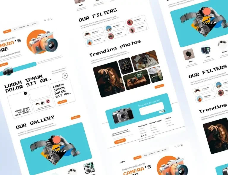
06. Image Slider & Carousel
When your work speaks louder than words portfolio images, product photos, project showcases, team photographs, before-and-after comparisons a slider or carousel section gives you a dedicated, visually compelling way to present it without overwhelming the page layout.
Sliders work exceptionally well for creative agencies displaying project work, e-commerce stores featuring new arrivals, photographers and designers showcasing portfolios, and any business wanting to rotate promotional banners or seasonal offers. The key is to use sliders strategically, not as a default hero replacement.
07. Call-to-Action Section
Every page on your website should have exactly one primary action you want visitors to take. The call-to-action section is the explicit, visually distinct moment where you ask for it surrounded by contrast, space, and clear visual hierarchy that makes the right next step impossible to miss.
High-converting CTA sections are visually separated from surrounding content (typically through a contrasting background colour), contain a single clear ask, feature benefit-focused copy rather than generic button text, and create appropriate urgency without resorting to manipulative pressure tactics.
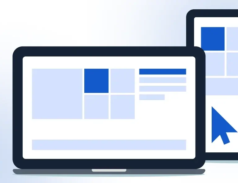
08. Content Blocks
Content blocks are the versatile section type that handles everything between your hero and your footer that doesn’t fit neatly into a specific widget category. They’re the pre-designed two-column, three-column, and full-width layouts you use to present text alongside images, features alongside descriptions, stats alongside copy, and team members alongside biographies.
Think of content blocks as your page’s structural backbone. Where specialised widgets handle specific functions (testimonials, sliders, blog grids), content blocks handle everything else — and they do it with beautiful, flexible, professionally designed layouts that you customise with your own content.
09. WooCommerce Product Sections
For WooCommerce store owners, the product showcase section is where revenue is won or lost. A well-designed product section communicates product value at a glance with clean imagery, clear pricing, prominent add-to-cart buttons, and enough product context to build purchase confidence without overwhelming the visitor.
OneClickBlocks is fully WooCommerce compatible. This means you can design high-converting product pages, promotional sections, featured product grids, and sale callouts using the same familiar drag-and-drop workflow without installing a separate WooCommerce builder or writing custom PHP.
10. The Footer
The footer is the most underestimated section on most websites. Visitors who scroll all the way to the bottom are your most engaged prospects; they’ve read your content, evaluated your offer, and they’re looking for one final piece of reassurance before making contact. A weak footer squanders that opportunity. A strong footer converts it.
An effective footer contains your logo and a brief brand descriptor, primary navigation links grouped by category, contact information and social media links, legal pages (Privacy Policy, Terms), and a final CTA. Visitors scroll footers looking for legitimacy signals; give them everything they need to feel confident.
To conclude
Every professional website on the internet, regardless of industry, size, or budget, is built from some combination of these ten sections. The difference between a website that performs and one that doesn’t isn’t usually the technology, the hosting, or the color scheme. It’s whether the right sections are present, in the right order, built with enough quality to earn the visitor’s trust.
OneClickBlocks gives you all ten in a single, free-to-start Elementor add-on. No plugin conflicts, no bloated code, no rebuilding the same sections from scratch for every new project. Install it once, and every essential section is ready when you need it professionally designed, fully responsive, and completely yours to customise.
Your next great website is ten sections away.