Smart Layout Ideas for Business, Portfolio, and Landing Pages

What’s Inside
Not every page needs the same layout. Business sites, portfolios, and landing pages each have a different job and a different visual logic. This guide breaks down what actually works for each, and how to build it faster with the right blocks.
Layout is not decoration. It is direction. A page layout tells your visitor where to look, what to trust, and what to do next, often before they have read a single sentence. This is why two websites with identical content but different layouts can produce wildly different results: one converts, one doesn’t. One feels credible, one feels uncertain. The layout did that.
The challenge is that different types of pages have fundamentally different goals and therefore different layout logic. A business website is building trust over time. A portfolio is making an emotional case for talent. A landing page is racing against a short attention span to produce a single conversion. Applying the same layout thinking to all three is one of the most common mistakes made in web design, and it’s one that a smart block library can help you avoid from the very first section you drag onto the page.
94% of first impressions of a website are related to its design and layout, not its content, copy, or offer. Visitors judge structure before they judge substance.
That number deserves to sit with you for a moment. Ninety-four per cent. The words you spent weeks crafting, the offer you spent months refining, the photos you paid a photographer to capture all of it comes second to the layout. Structure is the first thing your visitor processes, and it determines whether they engage with everything else.
Three Page Types. Three Different Jobs.
Before talking about specific layout ideas, it helps to be precise about what each page type is actually trying to accomplish. Confusing these goals or designing one page type with the instincts of another is where most layout mistakes originate.
Page Type 01 The Business Website
A business website’s job is to build credibility over multiple visits and convince a considered buyer that you are the right choice. It needs to answer: who are you, what do you do, who have you done it for, and how does someone start working with you.
- Clear service or product overview above the fold
- Trust signals close to the top: testimonials, logos, numbers
- Easy navigation to specific service or product pages
- Multiple contact opportunities distributed throughout the page
- Consistent, professional visual language across every section
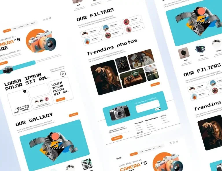
Page Type 02 The Portfolio
A portfolio’s job is to make an emotional, aesthetic case that the person behind it is talented, trustworthy, and worth hiring. Visitors are evaluating taste and skill simultaneously, which means the design of the portfolio is itself part of the portfolio.
- Work front and centre, not buried after a long bio
- Case studies over simple gallery grids where possible
- A distinctive visual identity that reflects personal style
- A short, specific bio that communicates specialism
- One clear way to make contact, repeated minimally
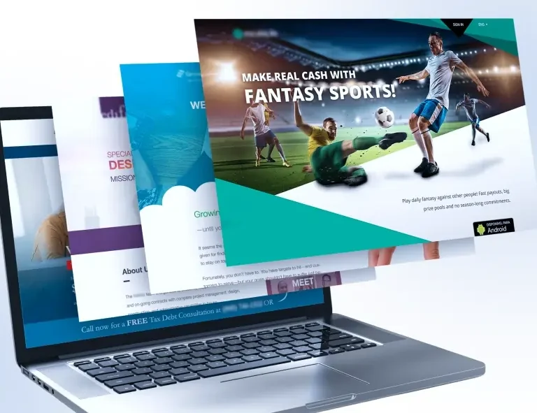
Page Type 03 The Landing Page
A landing page has one goal and one goal only: a single conversion. Subscribe, buy, register, download. Everything on a landing page should either move the visitor toward that action or be removed. Distraction is the enemy.
- No navigation menu; eliminate all escape routes
- Hero section with a crystal-clear value proposition
- Benefits over features lead with the outcome, not the mechanism
- Social proof positioned immediately after the hero
- CTA button repeated at least three times across the page
2 Smart Layout Ideas for Business Websites
The best business website layouts follow a logic of progressive trust-building. You begin wide establishing what you do in the broadest terms, and then narrow down, moving the visitor from general awareness toward specific interest and finally toward action. Every section should answer the next question a visitor is likely to ask.
| Did You Know?
Businesses that display client logos or testimonials in their hero section or immediately below it see an average of 34% higher click-through rate on their primary CTA compared to pages that place social proof further down. Trust built early converts faster. |
Here are the layout patterns that consistently perform well for business websites:
→ The Split Hero: Headline and CTA on the left, a strong image or visual proof element on the right. This layout communicates instantly: one half for what you do, one half for evidence that you do it well. It works because it respects the way Western readers scan: left to right, top to bottom.
→ The Three-Column Services Overview: Three cards, each representing a core service or product category, placed directly below the hero. This layout lets visitors self-select: they see what you offer and navigate to the area most relevant to them. Clean, scannable, and efficient.
→ The Alternating Sections Layout: Image left, text right. Then text left, image right. This rhythm keeps the page visually dynamic without being chaotic; each alternating section feels new while the overall structure remains coherent. Excellent for service-focused businesses explaining their process or approach.
→ The Stats Bar: A horizontal section of three or four large numbers years in business, projects completed, client satisfaction rate placed between two content sections. This acts as a visual proof point and breaks up text-heavy areas with authority.
→ The Full-Width Testimonial Block: One strong client testimonial displayed large, full-width, with attribution and ideally a headshot. This is not a carousel; it’s a statement. One well-chosen testimonial treated with visual weight is more convincing than six squeezed into a sliding widget.
Smart Layout Ideas for Portfolio Pages
Portfolio layout is a different creative challenge to business website layout. Here, the design itself is a signal. A photographer with a cluttered, text-heavy portfolio sends a message before a single image loads. A developer whose portfolio site is slow and poorly structured communicates something about their work before the visitor sees a line of code. The layout is the first sample of your work.
The most effective portfolio layouts share a few consistent qualities: they lead with work, not biography; they use whitespace generously to let pieces breathe; and they structure case studies as stories: problem, approach, result rather than static image galleries.
→ The Asymmetric Grid: Mixed-size project thumbnails arranged in an intentionally uneven grid. Larger tiles for hero projects, smaller for supporting work. This layout communicates creative confidence and draws the eye to your most important pieces without using a single word of instruction.
→ The Full-Screen Project Hero: Each project gets a full-screen or near-full-screen feature image at the top of its case study page. This forces the work to speak first. Copy below explains context, challenge, and result but the image makes the emotional case before any of that is read.
→ The Minimal Bio + Immediate Work Layout: The homepage opens with three lines of biography: who you are and what you specialise in, followed immediately by project work. No long paragraphs about your philosophy before the visitor has seen your output. Trust is earned by showing, not telling.
→ The Case Study List: Instead of a grid, a vertical list of projects each represented by a title, one-line description, and a single standout image. This layout signals depth; it says your projects have stories worth telling, not just images worth displaying.
Smart Layout Ideas for Landing Pages
Landing pages are the most structurally disciplined of the three page types. Every element exists for one reason: to move the visitor closer to clicking the CTA. This constraint is what makes landing page layout feel so different to work on and so powerful when done well.
→ The Benefit-Stack Hero: Headline communicates the primary benefit. Subheadline expands it. Three bullet points beneath list the secondary benefits. CTA button below. This is the single highest-converting hero layout in A/B testing history, precisely because it answers the visitor’s core question what’s in it for me in a single glance.
→ The Social Proof Sandwich: Hero at the top, immediately followed by a row of testimonials or logos, then the features section, then testimonials again, then the CTA. Social proof appears twice: once before the visitor is sold, once at the moment they’re deciding. This is the layout structure behind most high-converting SaaS and product landing pages.
→ The Objection Neutraliser Layout: An FAQ or objection-handling section placed directly above the final CTA block. By the time the visitor reaches the CTA for the last time, their most common hesitations have been addressed. This layout is particularly effective for higher-ticket offers where trust is the primary barrier to conversion.
→ The Urgency Close: A closing section just before the footer that restates the offer, introduces a reason to act now limited time, limited spaces, price increase and places the CTA prominently. This layout pattern is responsible for a disproportionate share of landing page conversions, because many visitors who were convinced midway through the page needed one final nudge.
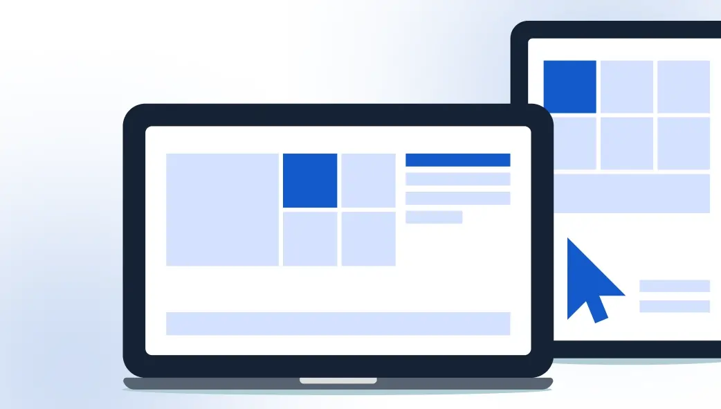
How Ready-Made Blocks Bring All of This Together
Understanding layout logic is one thing. Executing it quickly, responsively, and consistently across three different page types is another. This is where a block library like OneClickBlocks changes the practical reality of web design work.
Every layout pattern described in this article maps directly to one or more blocks in the OneClickBlocks library. The split hero? There’s a block for that. The stats bar? The testimonial statement section? The benefit-stack hero with a prominent CTA? Covered. You’re not trying to recreate these proven patterns from scratch; you’re pulling them into Elementor, dropping in your content and brand, and publishing.
The speed difference is significant, but what’s less obvious is the quality improvement. Ready-made blocks in a well-built library have already been refined for visual balance, spacing rhythm, and responsiveness. You’re not just building faster; you’re building on a foundation that has already solved problems you would have spent hours wrestling with.
And because OneClickBlocks blocks are designed to work together visually, you can mix a business hero block with a portfolio-style case study section and a landing page CTA block, and the page still feels coherent. That flexibility is what lets you create hybrid pages that serve complex goals without sacrificing visual consistency.
Before You Publish: Layout Quality Checklist
✓Does the hero section communicate what you do within 3 seconds?
✓Is social proof visible before the visitor needs to scroll far?
✓Is there a clear CTA in the hero, mid-page, and near the footer?
✓Does the page look and function correctly on mobile?
✓Are all sections visually consistent, with the same font system and the same spacing rhythm?
✓Have you removed any element that doesn’t serve the page’s primary goal?
✓Is the footer complete navigation, contact, and legal links all present?
Layout Is a Decision, Not an Afterthought
The most common layout mistake is treating it as something you figure out as you go, adding sections, moving things around, hoping it coheres by the time you hit publish. Layout that works comes from intention: understanding what the page needs to do, knowing which structure serves that goal, and executing it with consistency and speed.
Business sites need progressive trust. Portfolio sites need immediate proof. Landing pages need ruthless focus. When you approach each page type with that clarity and build it with ready-made blocks that already embody proven layout logic, you stop guessing and start building with confidence.
That’s what OneClickBlocks is built to enable: faster decisions, better foundations, and results that reflect genuine design intelligence rather than happy accidents.