Building Trust with Testimonials, CTA Blocks, and Feature Sections

Trust is not given; it is earned, one well-placed page element at a time. Here is exactly how to build it, and why it converts.
Imagine you walk into two different shops selling the same product at the same price. One has customer reviews on the wall, a clear “here’s what you get” display, and a friendly, obvious way to buy. The other has nothing no reviews, no clear offering, no obvious next step. You’d buy from the first shop without a second thought, even if you knew nothing else about either business.
Your website works the same way. Every visitor who lands on your page is making a rapid, largely subconscious assessment of one question: can I trust this? And the answer to that question is determined almost entirely by the elements you choose to include or leave out. Testimonials, CTA blocks, and feature sections are not merely design choices. They are your trust infrastructure. Get them right, and they do the selling for you, around the clock.
Why Trust Is Your Website’s Most Valuable Asset
You can have flawless copywriting, a beautiful design, competitive pricing, and a genuinely excellent product and still fail to convert visitors if they don’t trust you. Trust is the invisible prerequisite to every other conversion element working. Without it, even the most persuasive headline falls flat, and even the most generous offer gets ignored.
This is especially true for visitors landing on your site for the first time. They have no relationship with you, no prior experience of your brand, and no inherent reason to believe what you’re telling them. Their default state is skepticism, and it’s your job, through deliberate design choices, to move them from skepticism to confidence. That journey is what trust-building is.
The Psychology Behind Trust Signals
Understanding why certain page elements build trust helps you deploy them more deliberately. Trust on a webpage operates through several well-documented psychological mechanisms, and the three most powerful content blocks testimonials, CTA blocks, and feature sections each tap into a different one.
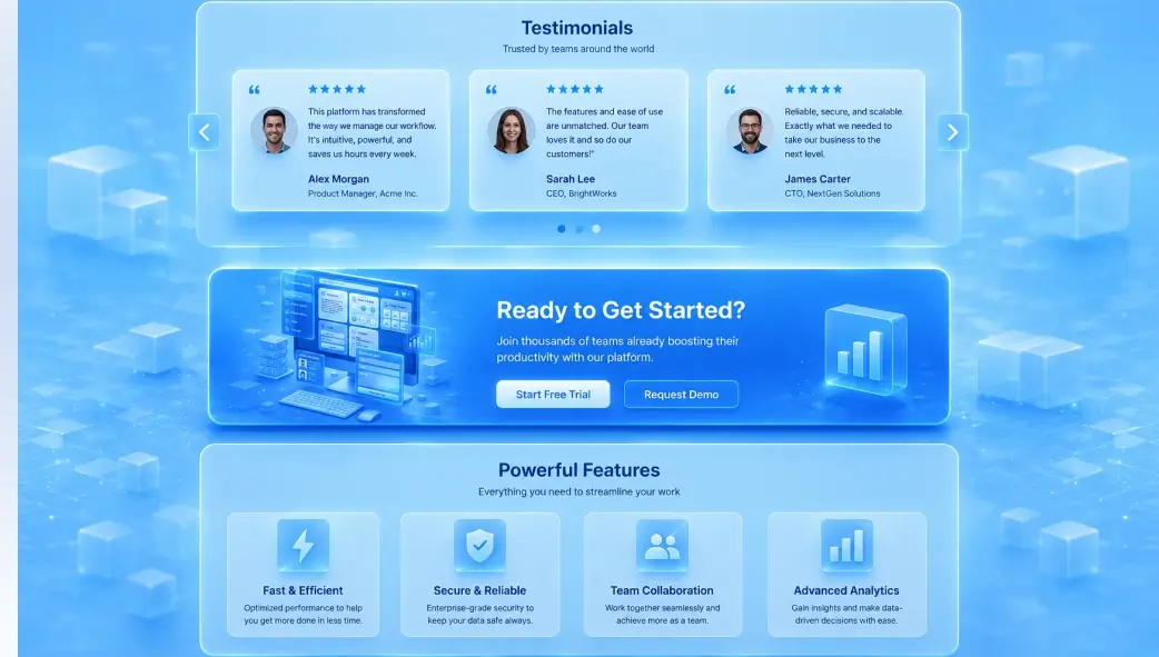
Social Proof (Testimonials)
When people are uncertain what to do, they look to what others have done. Psychologist Robert Cialdini identified social proof as one of the six core principles of persuasion. Testimonials are the purest expression of social proof on a webpage real people, in their own words, confirming that the risk of engaging with you is worth taking.
Clarity & Commitment (CTA Blocks)
Ambiguity breeds anxiety. When visitors can’t clearly see what happens next what they’re committing to, what they’ll receive they hesitate and leave. A well-designed CTA block eliminates that ambiguity. It tells the visitor exactly what to do, exactly what they’ll get, and exactly why now is the right time. Clarity is itself a trust signal.
Authority & Competence (Feature Sections)
Trust also comes from demonstrated expertise. When you clearly articulate what you offer, how it works, and what makes it different in a structured, confident visual presentation, you signal competence. Feature sections do this work. They transform “I can do this” into a credible, professional proof of capability that visitors can evaluate on their own terms.
Consistency (All Three Together)
Perhaps the most powerful mechanism of all is consistency. When your testimonials, CTA blocks, and feature sections all reinforce the same core message you are capable, others have benefited, and here is your clear next step visitors experience a coherent, trustworthy narrative. Inconsistency between these elements is one of the most common silent conversion killers.
Testimonials: The Most Persuasive Content You’ll Ever Have
A customer testimonial is the closest thing a website has to a trusted friend’s recommendation. It is the one piece of content on your page that wasn’t written by you, which is precisely what makes it so powerful. Visitors discount marketing copy instinctively. They do not discount the genuine words of someone who has already gone through what they are considering.
But not all testimonials are created equal. A vague testimonial “Great service! Would recommend!” does virtually nothing for trust. It is too generic, too unspecific, and too easy to dismiss as fabricated. The testimonials that actually move visitors are specific, story-like, and outcome-focused. They describe a recognizable problem, name the solution, and articulate a concrete result.
What Makes a Testimonial High-Trust
✦ Specificity: “Helped me build my site in a weekend” beats “Very easy to use” every single time. Specific outcomes are believable; generic praise is not.
✦ Named attribution: A full name and role (“Sarah M., Freelance Web Designer”) adds credibility. A photo adds even more. Anonymous testimonials are perceived as invented.
✦ Relatable context: The best testimonials describe a situation the visitor will recognize “I was spending hours building sections from scratch” before explaining the resolution.
✦ Emotional language: Reviews that describe how someone felt relieved, confident, or impressed trigger emotional resonance in the reader, not just intellectual acknowledgment.
✦ Recency: Testimonials from the past 12 months are perceived as significantly more credible than older ones. Refresh your testimonial section regularly.
CTA Blocks: Turning Trust into Action
A CTA block, a Call to Action section, is where all of your trust-building work gets put to use. It is the point on the page where you ask the visitor to do something: download, sign up, contact, buy, start. Done well, a CTA block feels like a natural, obvious next step. Done poorly, it feels like a pressure tactic, and nothing destroys trust faster than feeling pushed.
The anatomy of an effective CTA block is deceptively simple, but every element matters. Each component plays a specific psychological role in reducing friction and increasing the likelihood of action.
Anatomy of a High-Converting CTA Block
01. The Headline: Value, Not Command
Lead with what the visitor gains, not what you want them to do. “Start Building Better Websites Today” converts better than “Sign Up Now” because it answers “why should I?” before asking anything.
02. The Supporting Line Remove the Last Doubt
One or two sentences that neutralize the most common objection at this point in the decision. “No credit card required. Cancel anytime.” addresses commitment anxiety. “Works with any WordPress theme” addresses compatibility fear.
03. The Primary Button Specific and Active
Button copy should name the specific action and imply immediate value. “Download OneClickBlocks Free” outperforms “Submit” or “Click Here” because it is specific about what happens and makes the value (free) visible in the button itself.
04. The Secondary Option: Give an Escape Valve
A softer second option, “Explore all widgets first,” serves visitors who need more information before committing. Without it, they leave. With it, they stay engaged and often convert on a second visit.
05. Visual Contrast Make It Unmissable
The CTA block should stand out from surrounding content through background color, border, or spacing. Visitors who have read to this point are motivated; make the action visually obvious so they don’t have to hunt for it.
Feature Sections: Proving Your Value Visually
Testimonials tell visitors what others experienced. CTA blocks ask them to act. Feature sections explain what, exactly, they’re acting on. Without a clear, well-structured feature section, visitors are being asked to trust you and take action based on nothing more than a headline and someone else’s good experience. That’s often not enough, especially for higher-stakes decisions.
A feature section translates your capabilities into a visual, scannable format that visitors can evaluate quickly and retain easily. Icons anchor visual memory. Short headers communicate the benefit. Supporting copy explains the how. Together, they build the case for your product or service in a format that works with rather than against how people actually read websites.
Instant Setup
Install, activate, and start building immediately. No configuration required.
Fully Customizable
Colors, fonts, spacing every detail adapts to your brand with zero code.
Responsive by Default
Every widget looks perfect on desktop, tablet, and mobile automatically.
Theme Compatible
Works seamlessly with all major WordPress themes and Elementor versions.
Lightweight Code
Clean, optimized output that keeps your Core Web Vitals and SEO scores healthy.
WooCommerce Ready
Product pages, landing pages, and sales sections are all supported out of the box.
The feature grid above demonstrates exactly what a well-structured feature section does: in a few seconds of scanning, a visitor understands the key capabilities, each expressed as a benefit rather than a technical specification. Notice that each feature card leads with the outcome for the user: “looks perfect on all devices” rather than “responsive CSS breakpoints.” That framing shift, from specification to benefit, is the difference between a feature section that informs and one that persuades.
Common Trust-Killing Mistakes to Avoid
❌ Trust-Killers
- Generic, unattributed testimonials (“Great product!”)
- Stock photos used as “customer” avatars
- CTA buttons with vague text (“Submit”, “Click Here”)
- Feature sections written in technical specs, not benefits
- No testimonials above the fold or near CTAs
- Outdated testimonials (3+ years old)
- Multiple competing CTAs in one section
- Feature sections with 10+ items are overwhelming, not convincing
- CTA blocks with no supporting copy just a button
- Testimonials placed below the footer where nobody scrolls
✅ Trust-Builders
- Specific, named testimonials with role and photo
- Real customer photos or initials-based avatars
- Action-specific buttons (“Download Free”, “Start Building”)
- Feature sections framed as user outcomes and benefits
- Testimonial placed directly above primary CTA
- Refreshed testimonials from the past 12 months
- One primary CTA with a softer secondary alternative
- 3–6 focused feature cards that communicate the core value
- CTA with headline, supporting copy, and risk-removal text
- Testimonials at mid-page, just past the feature section