How Better Website Layouts Can Improve User Engagement


Layout is not decoration. It’s the invisible architecture that guides every visitor, and it decides, more than almost anything else, whether they stay or leave.
You’ve probably heard it said that you have about eight seconds to capture a visitor’s attention before they leave. But the truth is even sharper than that; eye-tracking studies show that users form a visual impression of a webpage in as little as 50 milliseconds. Before they’ve read a single word, before they’ve clicked a single link, they’ve already decided whether this page feels credible, navigable, and worth their time.
That decision is made almost entirely based on layout. Not copy. Not color. Not your logo. Layout. The way information is structured, spaced, and sequenced on a page is the single greatest determinant of whether a visitor engages with your content or bounces and finds someone else.
Why Layout Is the Foundation of Engagement
Engagement time on page, scroll depth, clicks, conversions don’t start with content. It starts with structure. A visitor who can’t immediately understand what a page is about, what they’re supposed to do next, or where the important information lives will leave before they ever get a chance to engage with your content.
Think of layout as the grammar of a webpage. Just as a sentence needs subject, verb, and object in the right order to communicate clearly, a page needs its elements headline, supporting content, call to action in a logical, visual hierarchy that guides the eye naturally from top to bottom. When the grammar is right, reading feels effortless. When it’s wrong, even the most compelling content fails.
| Fast Fact
According to research by the Baymard Institute, poor visual hierarchy is among the top reasons users abandon pages, even when the product or content itself is exactly what they were looking for. Layout confusion directly translates to lost conversions. |
The Real Cost of Poor Layout
Poor layout isn’t just an aesthetic problem; it has measurable business consequences. When a visitor struggles to navigate your page, they don’t dig deeper to find what they need. They leave. And when they leave, they rarely come back.
“People ignore design that ignores people.”
~ Frank Chimero, Designer & Author of ‘The Shape of Design.’
The damage compounds over time. A high bounce rate signals to search engines that your page isn’t satisfying user intent, which gradually pushes your rankings down, reduces your organic traffic, and increases your reliance on paid acquisition. Bad layout doesn’t just cost you one visitor; it costs you the compounding SEO value every visitor could have generated.
| Common Mistake
Many website owners focus obsessively on content quality while neglecting layout entirely, then wonder why their bounce rate is high. Excellent content inside a confusing layout is like a great book with all its chapters shuffled randomly. The value is there; the reader just can’t access it. |
Layout Principles That Drive Engagement
Decades of UX research have distilled a handful of layout principles that consistently improve engagement across virtually every type of website. These aren’t trends; they’re fundamentals that hold true whether you’re building a SaaS landing page, a WooCommerce store, or a personal portfolio.
Visual Hierarchy
The most important principle of all. Visual hierarchy is the practice of making the most critical element on a page the most visually dominant through size, weight, color, or position. Your headline should command the most attention. Your supporting copy should be secondary. Your call to action should be clear and unmissable. When these priorities are muddled when everything is the same size, the same weight, the same visual importance the eye doesn’t know where to go, and the visitor doesn’t know what to do.
White Space (Negative Space)
Counterintuitively, the empty parts of a page work just as hard as the filled parts. White space the breathing room between sections, paragraphs, images, and columns reduces cognitive load, directs attention toward key elements, and signals quality and credibility. Crowded layouts feel stressful. Spacious layouts feel trustworthy. Premium brands understand this intuitively; it’s why high-end websites never feel cluttered.
F-Pattern and Z-Pattern Reading
Eye-tracking research consistently shows that users don’t read webpages; they scan them, typically in an F-pattern (on content-heavy pages) or a Z-pattern (on simpler, single-focus pages). Smart layout design places your most critical information your hook, your differentiator, your CTA directly in the natural path of that scanning behavior. If your most important message lives outside the F or Z path, most visitors will never see it.
Consistent Grid Structure
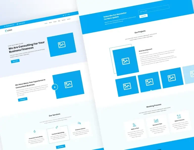
Pages built on a consistent column grid feel organized, trustworthy, and easy to navigate. Random spacing and inconsistent alignment create subtle visual tension that users feel even if they can’t articulate why. Elementor’s column system, paired with block-based layouts from OneClickBlocks, gives you a consistent grid framework that maintains visual harmony across every section of every page.
| Did You Know?
The concept of the “fold” the visible area of a webpage before a user scrolls comes from print newspapers, where the most important stories were literally placed above the physical fold of the paper so they’d be visible on newsstands. The digital equivalent still holds: content above the fold receives the most attention, and what you place there dramatically influences whether visitors scroll further. |
Above the Fold: Your Most Valuable Real Estate
The section of your page visible before any scrolling, above the fold, is where the engagement decision is made. If what a visitor sees in those first moments doesn’t communicate what the page is about, why it matters to them, and what they should do next, the majority will leave without scrolling at all.
Getting the above-the-fold layout right means balancing three things simultaneously. First, a clear headline that immediately communicates the page’s purpose and value. Second, a visual anchor: an image, illustration, or strong typographic treatment that creates an emotional response and establishes tone. Third, an obvious next action a button, a form, a scroll indicator that tells the visitor exactly what to do once they’ve been hooked.
01. Lead with value, not features
Your headline should answer “what’s in it for me?” within three seconds. Lead with the outcome your visitor wants, not the attributes of what you offer.
02. One primary CTA above the fold
Every additional action you offer reduces the likelihood of any action being taken. One clear, prominent CTA outperforms three competing ones every time.
03. Visual weight top-left, action top-right
Users read left to right. Place your brand identity or headline on the left where eyes land first; place navigation and CTAs on the right where decisions are made.
04. Hint at below-the-fold content
A partial image, a truncated section, or a gentle scroll indicator signals to visitors that there’s more to discover, increasing scroll depth significantly.
Layout Patterns That Work and Ones That Don’t
Some layout patterns are so well-established that visitors encounter them on virtually every site they visit, which means they’ve internalized the navigation patterns and can find what they need without thinking. Others, despite looking “creative” or “different,” break those expectations and cost you engagement.
❌ Layouts That Hurt Engagement
- Centered navigation with no clear hierarchy
- Full-screen popups appearing immediately on load
- Multiple competing CTAs in the same section
- Dense text blocks with no visual breaks
- Inconsistent column widths across sections
- Auto-playing sliders that users can’t control
- No whitespace between major sections
- Important content buried below long walls of text
✅ Layouts That Drive Engagement
- Sticky header with clear navigation + one CTA
- Single, well-timed opt-in triggered by scroll depth
- One primary action per section, logically sequenced
- Short paragraphs with section headers and pull quotes
- Consistent 12-column grid throughout the page
- Controlled carousels or sliders with user controls
- Generous padding between major content blocks
- Progressive disclosure reveals details as the visitor scrolls
How OneClickBlocks Helps You Build Engaging Layouts
One of the biggest obstacles between knowing good layout principles and actually implementing them is the gap between intention and execution. You know your homepage needs a strong testimonials section. You know your services page needs clean card layouts. You know your header should be sticky and structured. But building all of that from scratch inside Elementor, especially while keeping everything visually consistent, is time-consuming, and the smallest spacing mistake can undermine the whole effect.
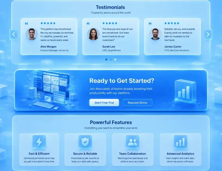
That’s exactly the gap OneClickBlocks fills. Every widget in the OneClickBlocks library has been designed with engagement-first layout principles baked in. The Testimonial Widget places social proof in layouts that are proven to build trust without overwhelming the surrounding content. The Service Blocks use structured card patterns that create clear visual hierarchy between services. The Callout Boxes use contrast and focal weight to draw the eye without feeling aggressive or spammy.
Mobile Layout: The Priority You Can’t Ignore
Any conversation about layout and engagement that doesn’t center mobile is incomplete. As of 2024, over 60 percent of global web traffic comes from mobile devices. Your desktop layout might be pristine, but if your mobile layout breaks the hierarchy, squishes the spacing, or makes the CTA hard to tap, you’re losing the majority of your visitors before they ever engage.
| Did You Know?
Google’s Core Web Vitals, the ranking signals that directly affect your SEO, are evaluated primarily on mobile. A layout that looks great on desktop but performs poorly on mobile doesn’t just hurt your user experience; it actively damages your search rankings. Layout quality is literally an SEO factor. |
Mobile layout requires rethinking, not just resizing. On mobile, the F-pattern collapses into a vertical scroll, so every element needs to stack in a logical reading order. Multi-column layouts need to reflow gracefully into single columns without losing context or hierarchy. CTAs need to be large enough to tap comfortably with a thumb, and spaced far enough apart that accidental clicks aren’t a problem.
- Test your layout on actual mobile devices, not just the browser’s responsive preview
- Ensure tap targets (buttons, links) are at least 44×44px, Apple’s minimum recommendation
- Stack content in a logical reading order when columns collapse on small screens
- Reduce font size steps between headings and body copy on mobile to maintain hierarchy
- Keep forms short; long forms perform dramatically worse on mobile than on desktop
- Confirm that sticky headers don’t consume too much vertical space on small screens
- Use OneClickBlocks’s responsive widgets, which are designed to reflow correctly on all device sizes without manual breakpoint tweaking
Measuring Layout Impact on Engagement
Improving your layout is only half the work. The other half is measuring whether the changes you’ve made are actually improving engagement and knowing which metrics to look at. Not all engagement signals are equally meaningful, and some can be misleading if read without context.
Bounce rate is your first alarm signal if someone lands and immediately leaves; the above-the-fold layout almost certainly isn’t doing its job. Scroll depth tells you how far down the page your layout keeps visitors engaged, and where they lose interest, which is often the most actionable insight for layout improvements. CTA click rate is the ultimate test of whether your layout is successfully guiding visitors toward the actions you want them to take.
Tools like Google Analytics 4, Microsoft Clarity (free heatmaps and session recordings), and Hotjar can show you exactly where visitors click, how far they scroll, and where they drop off. Run a layout change, wait for statistically meaningful data, and compare. Even modest improvements in layout can generate significant gains in engagement metrics, and those gains compound over time into meaningful business outcomes.
The bottom line:
Layout is not a design preference; it’s a performance lever. Every section you structure thoughtfully, every hierarchy you clarify, every whitespace decision you make intentionally is an investment in engagement. And in the world of WordPress and Elementor, tools like OneClickBlocks exist precisely to make those best-practice layouts accessible to everyone without a design degree, without a developer, and without starting from a blank canvas.