Which Website Sections Help Turn Visitors into Leads

Not every section on your website earns its place. Learn which ones actually drive enquiries, sign-ups, and sales, and how to build them fast with Elementor.
You can have the most beautifully designed website in the world, but if the right sections aren’t in the right places, visitors will leave without taking any action. Traffic without conversion is just noise.
In this guide, we break down the specific website sections that are proven to turn passive visitors into real leads. We’ll look at the psychology behind each, the design principles that make them work, and how to build all of them inside Elementor using OneClickBlocks without a single line of code.
80% of website visitors never scroll past the fold, making your hero section the most critical conversion real estate on the page.
3.2× more leads are generated by websites that include social proof (testimonials, reviews) compared to those that don’t.
202% more leads can be generated by landing pages with a single focused CTA versus those with multiple competing actions.
| Quick Fact
The average website visitor decides whether to stay or leave within 10–20 seconds of landing on a page. The sections you place above the fold determine whether you earn those next critical minutes of attention. |
Why Not All Sections Are Created Equal
Think of your website like a physical store. The window display (hero), the sales team (service section), the reviews on the wall (testimonials), and the checkout counter (CTA) all play distinct roles. Remove any one of them and conversions drop. The goal isn’t to have more sections; it’s to have the right ones, in the right order, doing the right job.
Web designers and conversion specialists have spent decades studying which sections move the needle. The findings are consistent: six core section types account for the vast majority of lead generation on any business website.
The 6 Website Sections That Actually Convert
Here are the sections that consistently generate leads, ranked by their direct impact on visitor action.
- Hero Section
The hero is the first thing every visitor sees. It must immediately answer three questions: What is this? Is this for me? What do I do next? A strong headline, supporting subtext, and a single CTA button are all you need. Vague heroes kill conversions before they begin.- Highest Impact
- Above the Fold
- Primary CTA
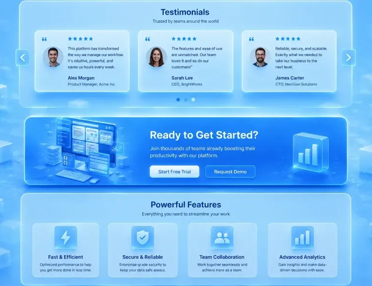
- Testimonials Section
Humans are wired to trust other humans more than brands. A well-placed testimonials section short-circuits visitor skepticism. Use real names, outcomes, and photos or ratings whenever possible. Generic “Great service!” quotes do almost nothing.- Social Proof
- Trust Builder
- Call-to-Action (CTA) Block
A standalone CTA section exists for one reason: to prompt action. Place it after the hero, mid-page, and again at the bottom. Use action-oriented language like
“Get a Free Quote” or “Start Today.”- Direct Response
- Multi-placement
- Essential
- Services / Features Section
Visitors who aren’t sure if you solve their problem won’t convert. A clean services block with clear headings, benefit-led descriptions, and visuals creates clarity fast.
Lead with outcomes, not features.- Clarity Driver
- Benefit-led
- Callout / Banner Blocks
Attention fades as users scroll. A well-designed callout block re-focuses attention with a bold headline and short conversion prompt. High contrast, short copy,
and one clear link are the formula.- Re-engagement
- Mid-page
- Header & Footer
A cluttered header is a conversion killer. Keep navigation focused and include one strong CTA. Your footer should organise contact info, policies, and social links clearly. Both should stay globally consistent across every page.- Global Element
- Trust Signal
| Did You Know?
Websites that display customer testimonials earn 62% more revenue per visitor than those without any form of social proof. Even a single well-written testimonial placed near a CTA can meaningfully lift conversion rates. (Source: Reevoo B2B Research) |
Section-by-Section Conversion Impact Table
Here’s how each key website section compares in terms of its typical contribution to lead generation and visitor-to-action conversion:
| Website Section | Primary Role | Conversion Impact | Best Placement | Without It… |
| Hero Block | First impression + primary CTA | Very High | Top of every page | Visitors have no anchor |
| Testimonials | Trust & social proof | Very High | Below hero or services | Doubt goes unaddressed |
| CTA Block | Direct lead trigger | Very High | After hero, mid, end | No clear next step |
| Services Section | Explain your offering | High | Below hero | Visitors unsure if you help |
| Callout / Banner | Re-engage mid-page | Medium–High | Between sections | Attention drops off |
| Blog Posts Block | Authority & SEO traffic | Medium | Near footer or homepage | Missed organic traffic |
| Slider / Gallery | Visual engagement | Moderate | Portfolio / product pages | Harder to show range |
| Header & Footer | Navigation + trust signals | High (indirect) | Global (all pages) | Looks unfinished / untrustworthy |
| Did You Know?
Pages with video in the hero section see up to 86% higher conversion rates than those with static images alone, but only when the video auto-plays muted and loads instantly. Slow-loading media in the hero kills the effect entirely. (Source: Wyzowl Video Marketing Report) |
How to Build Every Lead-Generating Section with OneClickBlocks
Every one of the sections above is available as a ready-made widget inside OneClickBlocks for Elementor. No coding, no design skills needed just drag, drop, and customise to match your brand.
Header Builder: Custom sticky headers with built-in CTA buttons no theme restrictions Lead Capture
Testimonial Widget: Show real client reviews in stylish card layouts that build instant trust Social Proof
Callout Boxes: Eye-catching mid-page banners that re-engage and guide visitors to act Re-Engagement
Service Blocks: Modern grid layouts that clearly explain what you do and who it’s for Clarity
Content Blocks: Pre-designed full sections for features, about, and hybrid content areas Flexible
Footer Builder: Design consistent, trust-reinforcing footers across your entire site Trust Signal
5 Section Mistakes That Kill Conversions
✕Generic hero copy. “Welcome to our website” tells visitors nothing. Every word in the hero must earn its place with a specific, compelling benefit statement.
✕ Testimonials buried at the bottom. If your social proof only appears in the final scroll, most visitors will never see it. Move at least one strong testimonial near the top.
✕ Too many CTA choices. “Book a call, download a guide, follow us on Instagram, subscribe to the newsletter” multiple CTAs dilute each other. Pick one primary action per section.
✕ Services listed as features, not benefits. “We use React.js and TypeScript” means nothing to a business owner. “We build websites that load in under 2 seconds” means everything.
✕ A broken or missing mobile layout. Over 60% of web traffic is mobile. A services grid that stacks badly or a CTA button that’s too small to tap costs you more than half your leads.