
The OneClickBlocks Clients / Partners / Logos Widget is a powerful Elementor widget that lets you display your client logos, partner brands, and sponsor images in beautifully structured layouts — directly on any WordPress page. Whether you want a simple logo grid, a two-column section with description text, an arc arrangement, circular frames, or image cards with descriptions, this widget gives you multiple pre-built layout options to match your website design. It is fully configurable through the Elementor left panel with no coding required, making it ideal for business websites, agency portfolios, and product landing pages looking to build trust and credibility through social proof.
Go to your WordPress Dashboard and navigate to OneClickBlocks → Elements. Find the Clients / Partners / Logos Widget, toggle it to Enable, and click Save Settings.
Next, open any page in the Elementor Editor. In the left panel, type “clie” or “client” in the widget search bar. The Client Partners Logos widget will appear in the results. Drag and drop it onto your page canvas into an empty container. The Edit Client Partners Logos panel will open on the left with three tabs — Content, Style, and Advanced.
All content options for this widget are available under the Content tab in the Elementor left panel. The panel is organized into the following sections: Clients Partners Logos (layout selector), Title, Images Repeater, and Reverse Images Repeater. Some sections are only active or relevant depending on the layout you choose.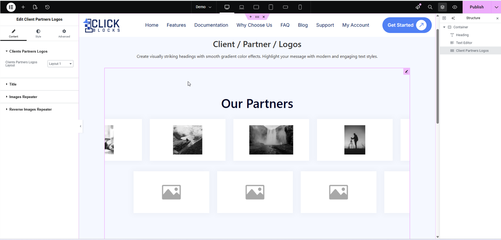
Use the Clients Partners Logos Layout dropdown to choose your preferred pre-built display style. Switching layouts instantly updates the live preview on the canvas. The following layouts are available:
Layout 1 — A standard full-width grid of logo images arranged in rows. Clean and minimal, ideal for displaying many logos side by side.
Layout 2 — A two-column section layout. The left column displays your section heading and a description text, while the right column displays the logo image grid. Best for sections that need context alongside the logos.
Layout 3 — A semicircle / arc arrangement. Logo images are positioned in a curved arc pattern above a central rounded badge displaying your section title. Visually distinctive and great for hero or feature sections.
Layout 4 — A card grid with descriptions. Each card includes an image placeholder, a description text field, and a diagonal arrow link icon. Suited for partner showcases where you want to add context to each logo. Includes both Image with Description and Image with Description Reverse sub-sections.
Layout 5 — Similar to Layout 4 but with a different card count arrangement (3 cards in the first row, 2 centered in the second row). Useful for a smaller, more focused partner list.
Layout 6 — A horizontal row of circular / oval-framed logo images beneath the section title. A polished, modern presentation suited for premium brand associations.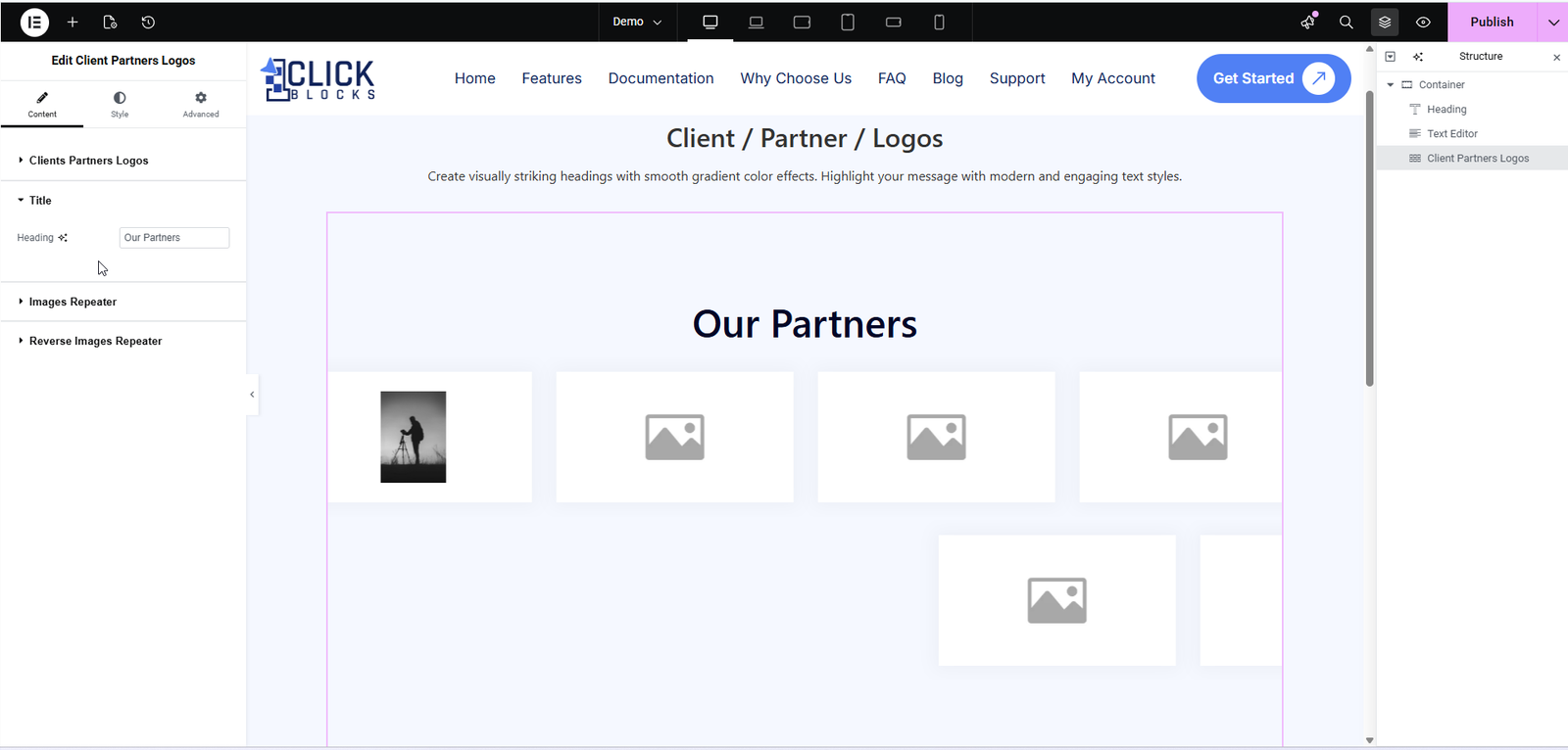
Enter the main heading text for your logos section. This is displayed as the section title above or alongside the logo images depending on the active layout. For example, Our Partners, Trusted By, or Our Clients. The field is pre-filled with Our Partners by default.
The Images Repeater section is where you add and manage all the logo images displayed in the widget. It contains the following controls:
A toggle switch that controls whether the logo images list is visible on the front end. Set it to Show to display the logos, or toggle it off to temporarily hide them without deleting the content. This toggle is visible when the section is expanded.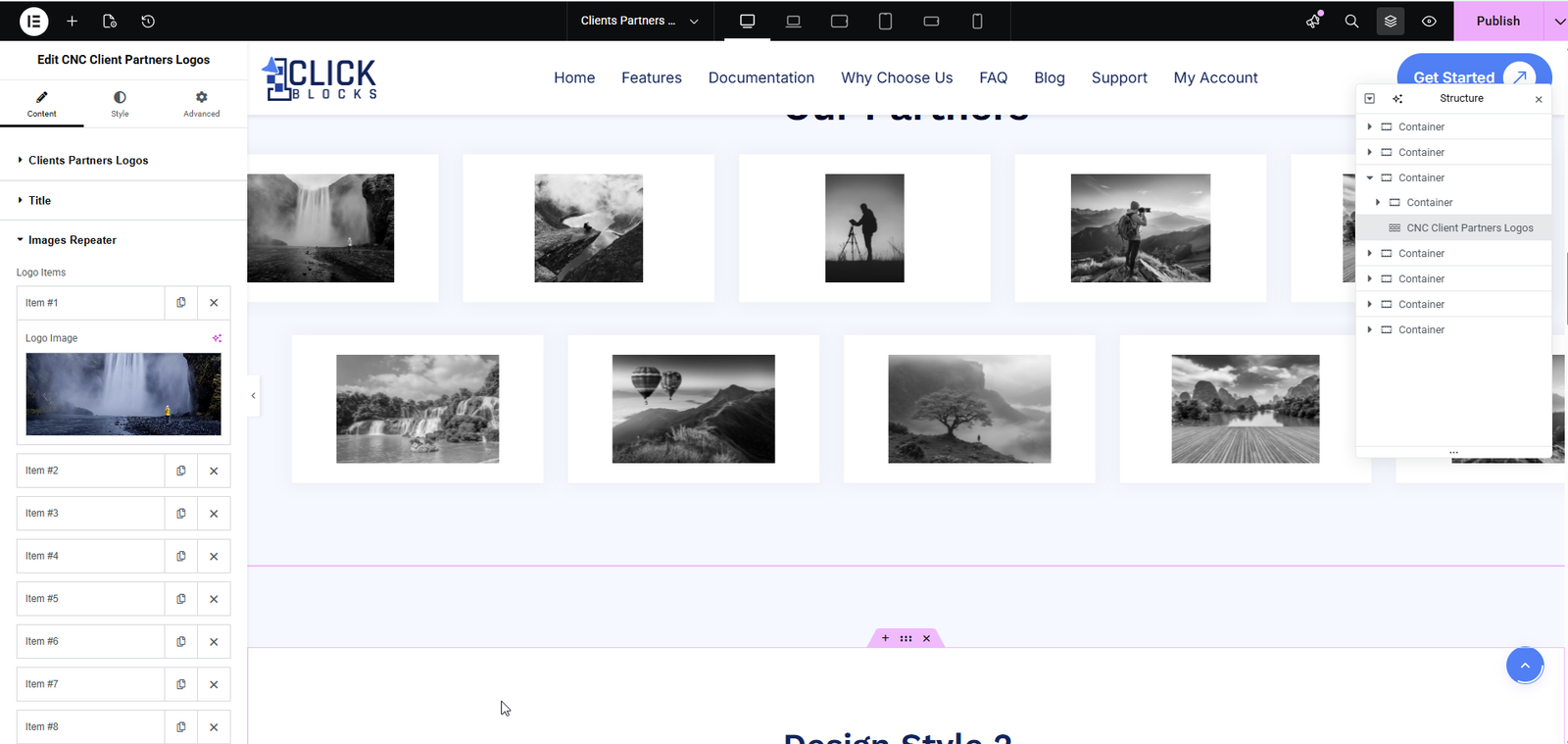
The repeater comes pre-loaded with 8 logo item slots by default. Click on any item (e.g., Item #1) to expand it and reveal its settings. Each item contains a Logo Image field — click the image upload area or the Choose Image button to open the WordPress Media Library and select or upload your logo file. The canvas updates in real time as each image is added. Use the × icon next to any item to remove it, and click + Add Item at the bottom of the list to add additional logos beyond the default 8.
The Reverse Images Repeater section provides a secondary set of logo items labeled Reverse Logos. This is used in layouts that support a mirrored or reversed logo row (displaying logos in the opposite direction or a second row). It works identically to the main Images Repeater — expand each item (Item #1 through Item #6 by default) to upload a logo image. Click + Add Item to add more entries as needed.
This section is available when Layout 4 or Layout 5 is selected. It contains a Repeater Items list where each entry represents one card in the grid. Expand an item to configure:
Image — Upload the logo or partner image that appears at the top of the card using the WordPress Media Library.
Description — Enter the text that appears below the image on the card. The field uses a full WordPress WYSIWYG rich text editor (Visual and Code tabs) so you can apply formatting such as bold, italic, links, and more. The placeholder text reads Enter Description Here.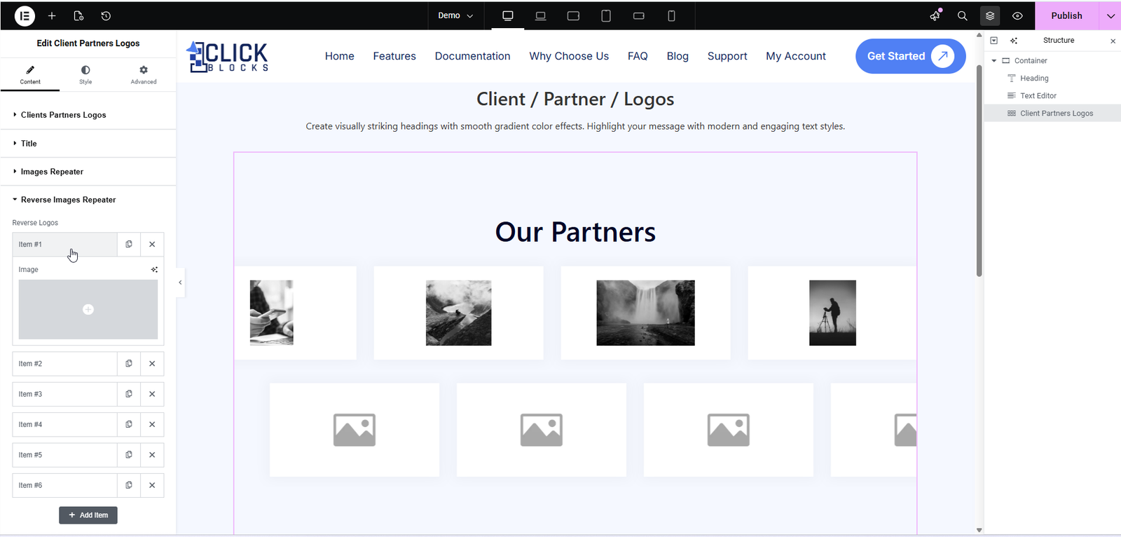
Also available in Layout 4 and Layout 5, this section mirrors the Image with Description section but populates the second set of cards in the layout (typically the second row). It contains the same fields — Image and Description — for each repeater item. By default it includes 4 items. Click + Add Item to expand the list or use the × icon to remove any entry.