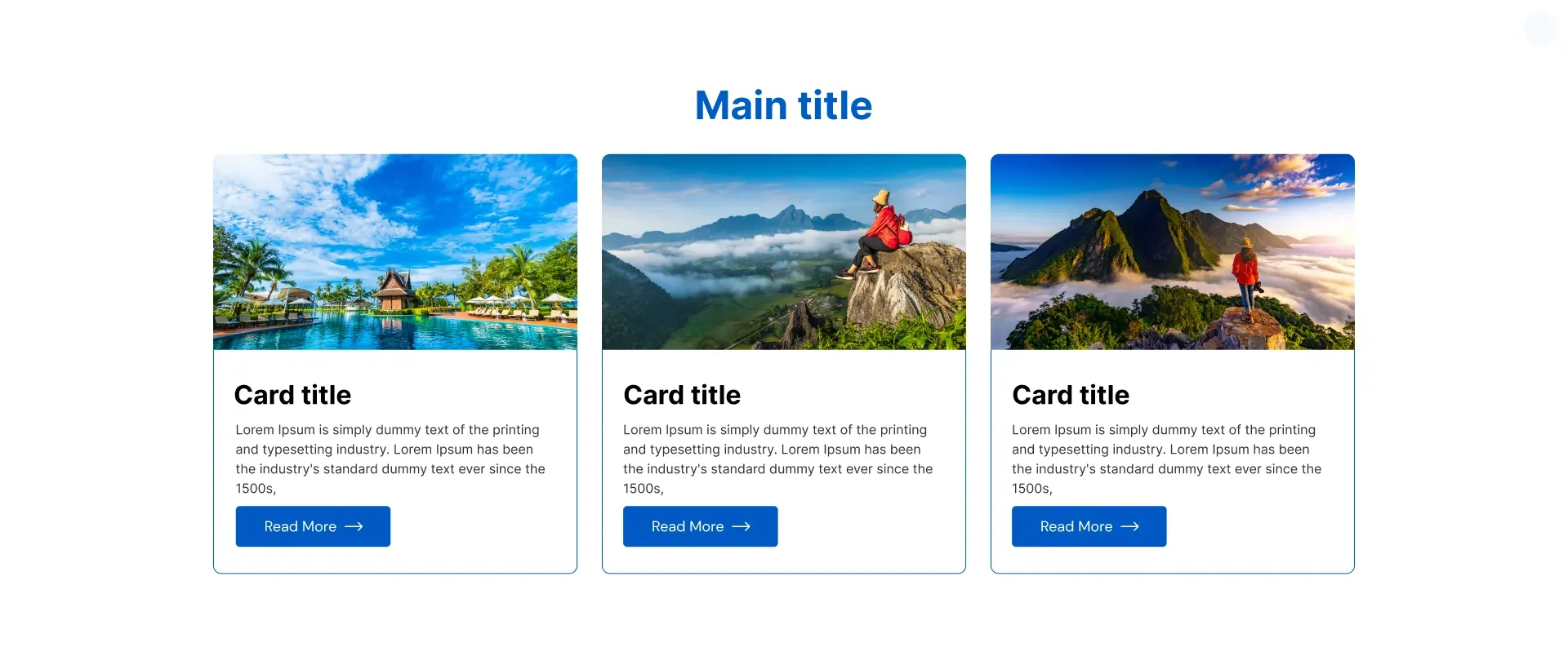
The Information Card widget by OneClickBlocks lets you display multi-column card sections inside Elementor with images, headings, descriptions, and call-to-action buttons. It includes 6 ready-made layout styles and is fully customizable — no coding required.
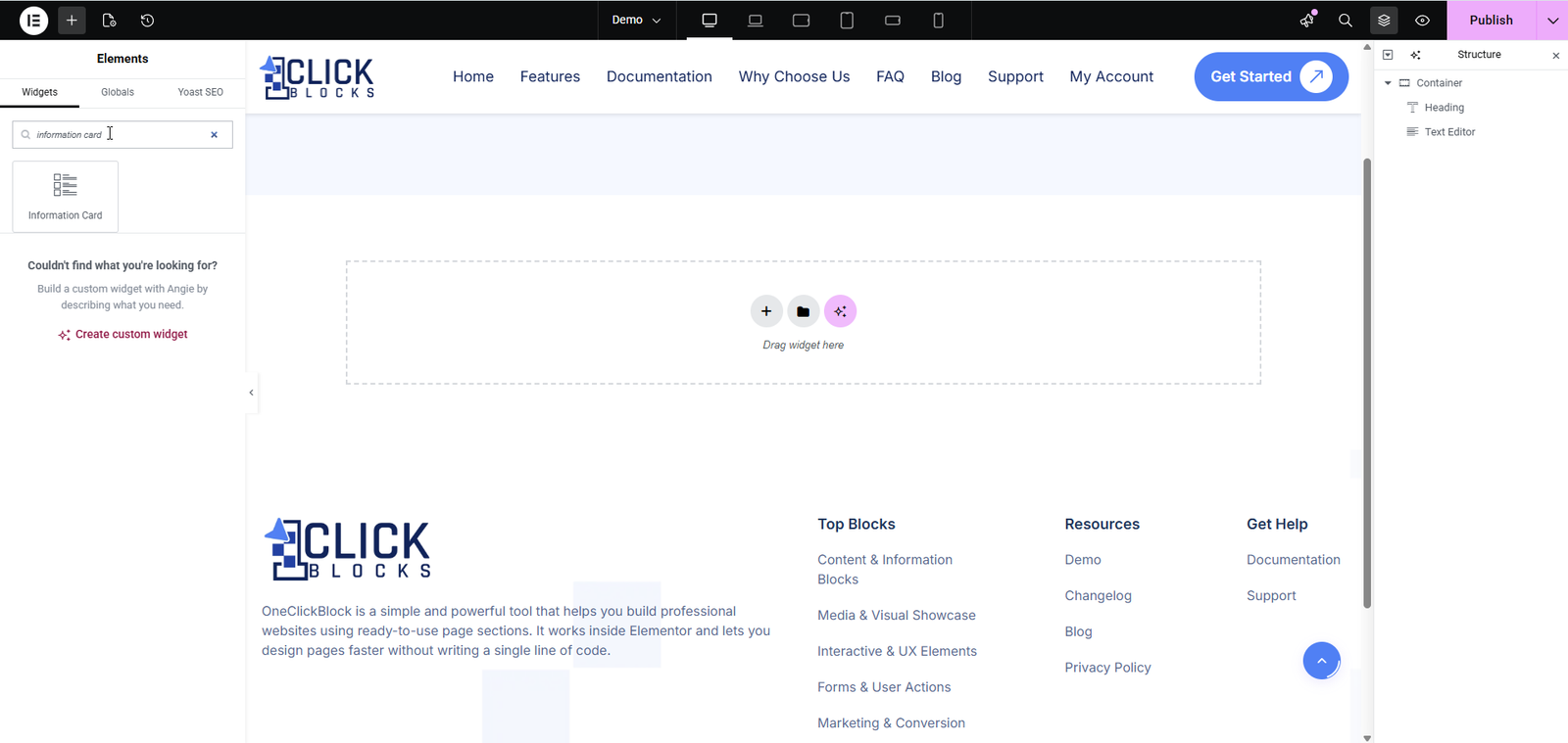
>Open any page in Elementor.
>In the left panel, type “inform” in the Search Widget box.
>Drag the Information Card widget onto your canvas.
The widget will load with a default 3-column layout and placeholder content.
Choose from 6 pre-built layout styles using the dropdown. Each layout changes the visual design of the card grid — from image cards and text-only cards to dark/light avatar-style cards and icon-overlay cards.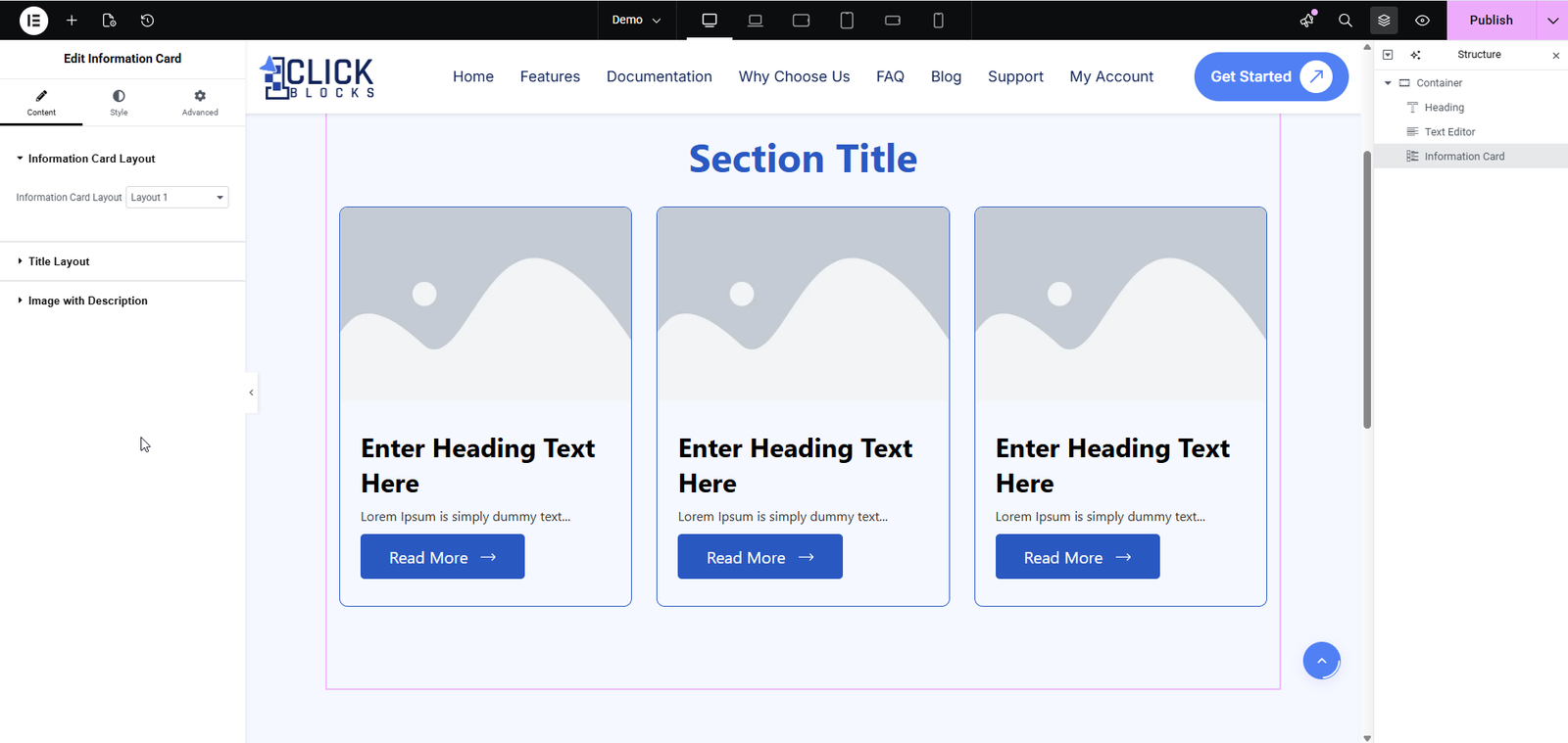
The section title displayed above the card grid. Example: “Our Services”.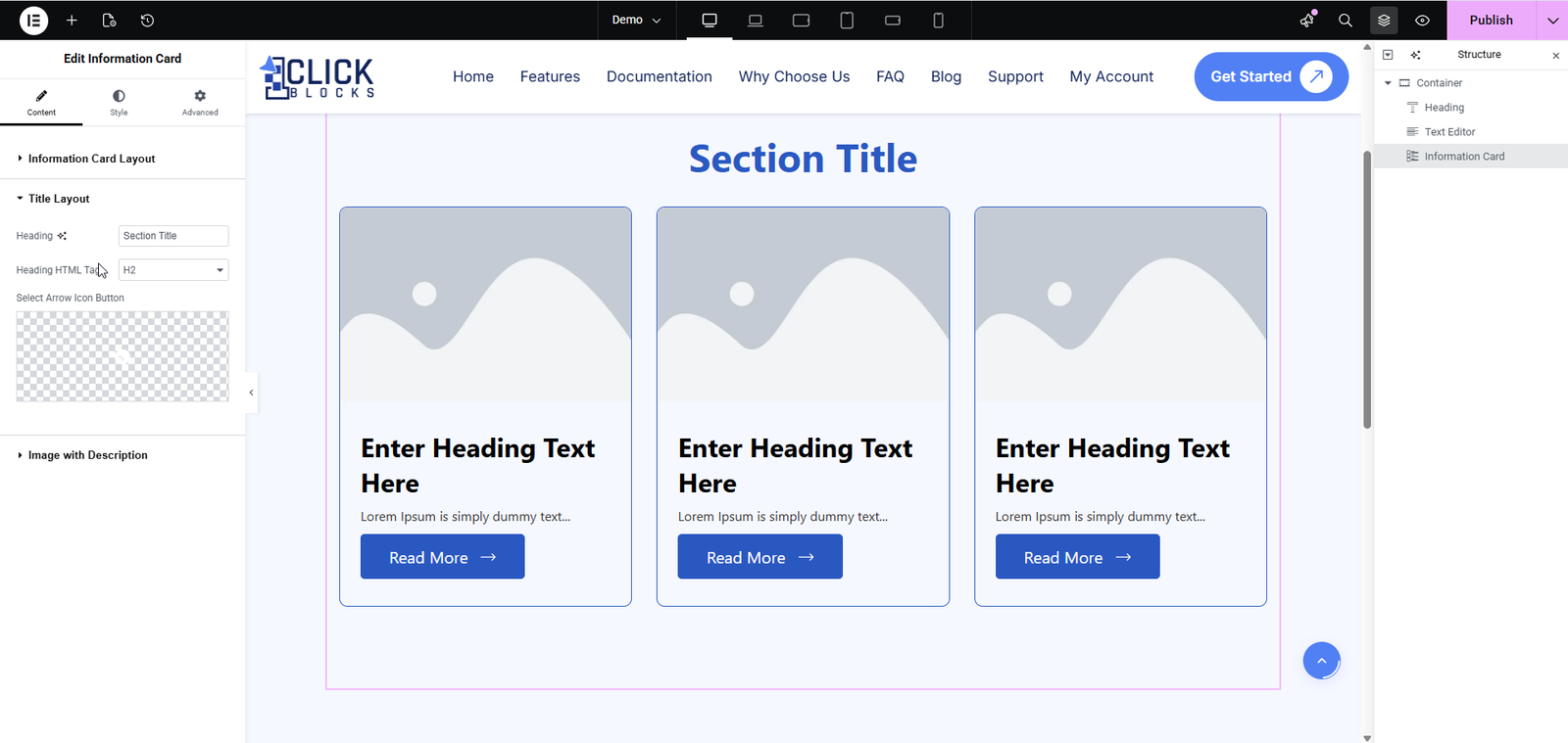
Sets the HTML tag for the section heading. Default is H2. Adjust based on your page’s heading hierarchy.
Optional. Upload or select a custom icon/arrow image to display alongside the section title.
This section manages the individual cards. Each card is a repeater item — you can add, duplicate, reorder, or delete cards as needed. Expand any item to edit its content.
Sets the HTML tag for the title inside each card. Default is H3.
The heading/title text for the card. Example: “Fast Performance”.
The body text for the card. Supports basic formatting via the rich text editor.
A URL to wrap the card with a hyperlink. Leave as # if no link is needed.
Toggle between an image or an icon for the card’s visual element.
Upload or select an image from the Media Library to display in the card.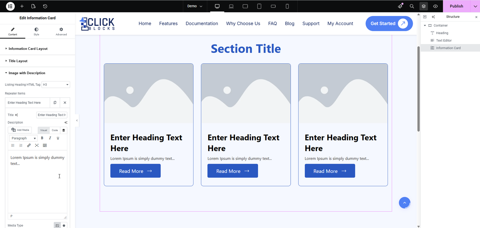
The label for the card’s CTA button. Default: “Read More”.
The link destination for the CTA button. Example: “https://yourdomain.com/contact”.
Adds a new blank card to the grid. Click to insert as many cards as needed.