
The OneClickBlocks Pricing Widget is a powerful Elementor addon designed to help you build beautiful, professional pricing tables and pricing pages without writing any code. With multiple pre-designed layout options, monthly and yearly billing toggles, feature comparison tables, and fully customizable content blocks, this widget lets you create pricing sections that clearly present your product or service plans. Whether you need a simple three-column price table or an advanced comparison layout with feature grids, the Pricing Widget gives you the flexibility to showcase your offerings in the most effective way.
In the left-side Elements panel, scroll down or use the search bar to find “Pricing” under the OneClickBlocks widgets section.
Drag and drop the Pricing widget into any section or container on your canvas.
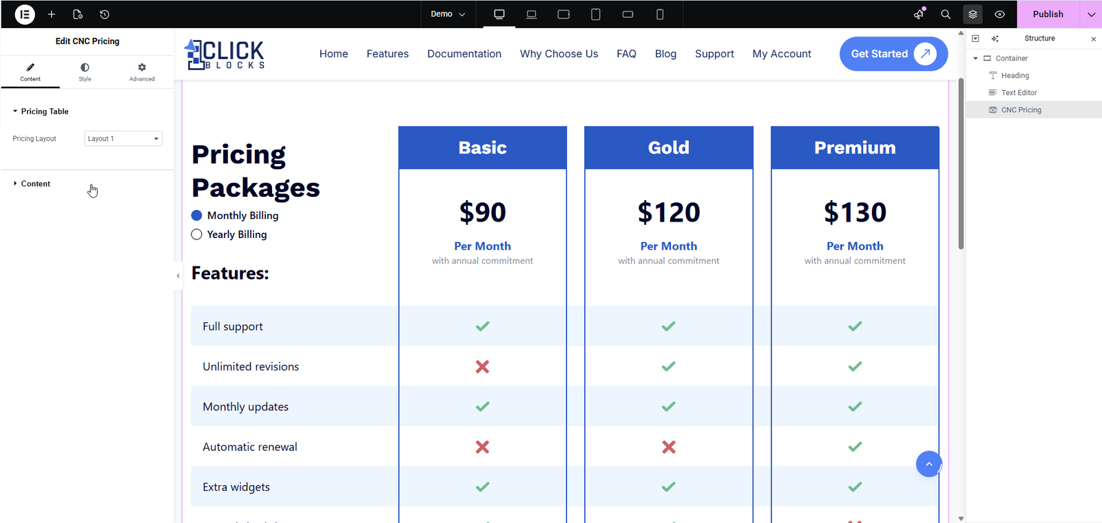
The Pricing Widget is now activated and ready to configure in the left settings panel.
Expand the Pricing Table section in the Content tab to access all layout and content settings for the pricing widget.
Choose from multiple pre-built layout options to display your pricing table. Simply select a layout from the dropdown to instantly change the design and structure of your pricing section. The widget supports multiple layout variations including table layouts, card-style grids, and comparison layouts.
The Content section controls the header text and billing toggle labels for your pricing table.
Enter the main heading text that appears at the top of your pricing section. For example, type Pricing Packages or Select Pricing Plan to help visitors understand the purpose of this section.
Use the rich text editor to add a descriptive paragraph or subtitle below the section title. You can format the text using Bold, Italic, Link, and Paragraph options. The editor also includes an Edit with AI option to help generate content quickly.
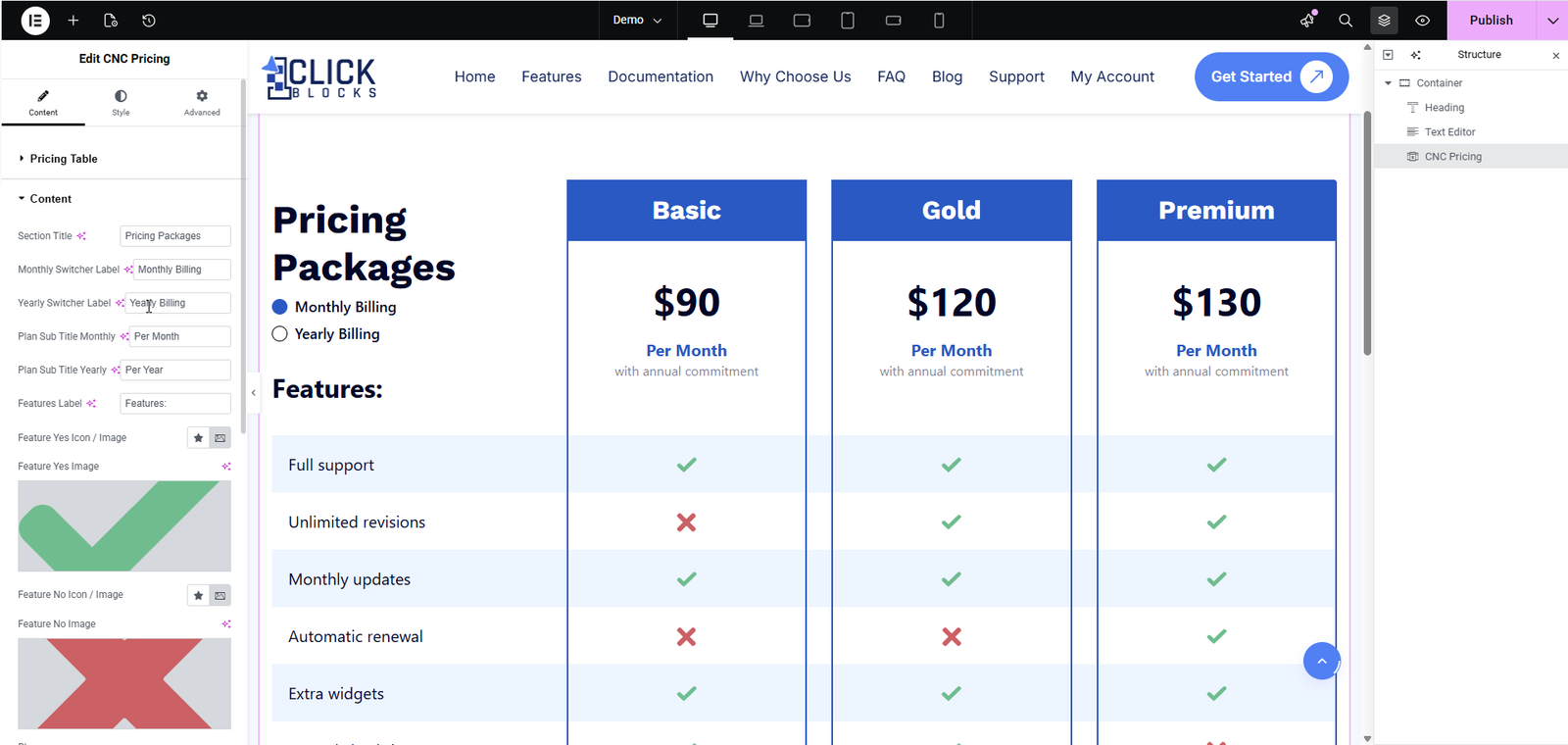
Enter the label text for the monthly billing option in the toggle switch. For example, type Monthly Billing or Monthly.
Enter the label text for the yearly billing option in the toggle switch. For example, type Yearly Billing or Annual.
Set the subtitle that appears below the price for plans displayed in monthly billing mode. For example, Per Month or monthly.
Set the subtitle that appears below the price for plans displayed in yearly billing mode. For example, Per Year or annually.
Enter the heading for the features column in a comparison table layout. For example, type Features: or What is Included.
Upload an image or select an icon to represent a positive (included) feature in the comparison table. A green checkmark icon is commonly used here.
Preview of the uploaded yes/feature-included image will be displayed here to help you verify it looks correct before publishing.
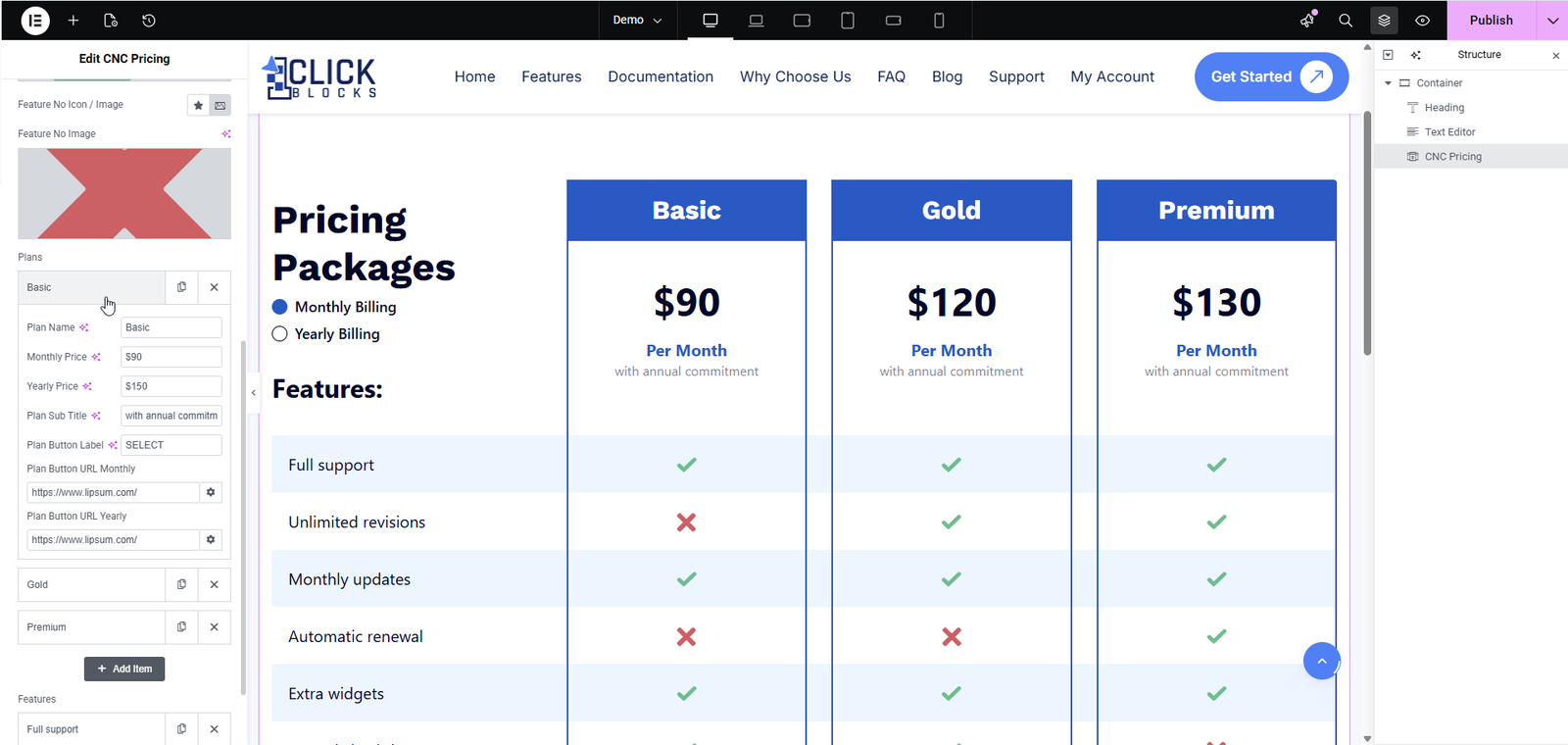
Upload an image or select an icon to represent a negative (not included) feature in the comparison table. A red X icon is commonly used here.
Preview of the uploaded no/feature-excluded image will be displayed here to help you verify it looks correct before publishing.
Enter a title for the featured/primary plan section. For example, type Unlimited or Most Popular to highlight your recommended plan.

