The Full Background Image with Content Widget by OneClickBlocks is a powerful Elementor widget that lets you create visually striking full-width sections combining a background image with overlaid content — including a title, description, and call-to-action button. With 5 ready-made layout styles, you can instantly build eye-catching hero sections, feature highlights, or promotional banners without writing a single line of code. This widget is fully compatible with Elementor and is ideal for businesses, agencies, and creatives who want to make a bold visual impact on their WordPress website.
Before you can use the Full Background Image with Content Widget inside Elementor, you need to activate it from the OneClickBlocks settings panel. Follow the steps below:
>Go to your WordPress Dashboard and navigate to OneClickBlocks → Elements.
>Find the Full Image Bg Content widget from the list of available widgets.
>Toggle the switch to Enable the widget.
>Click Save Settings to apply the changes.
>Open any page or post in the Elementor Editor.
>In the left panel, click the Elements (widget search) icon and type “full image” in the search bar.
>Drag and drop the Full Image Bg Content widget into your desired section or container on the canvas.
>The Edit Full Image Bg Content panel will open on the left with three tabs — Content, Style, and Advanced.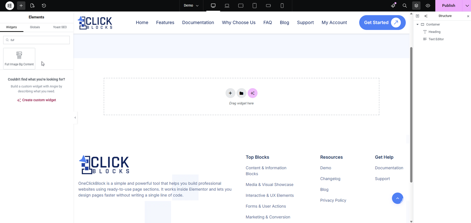
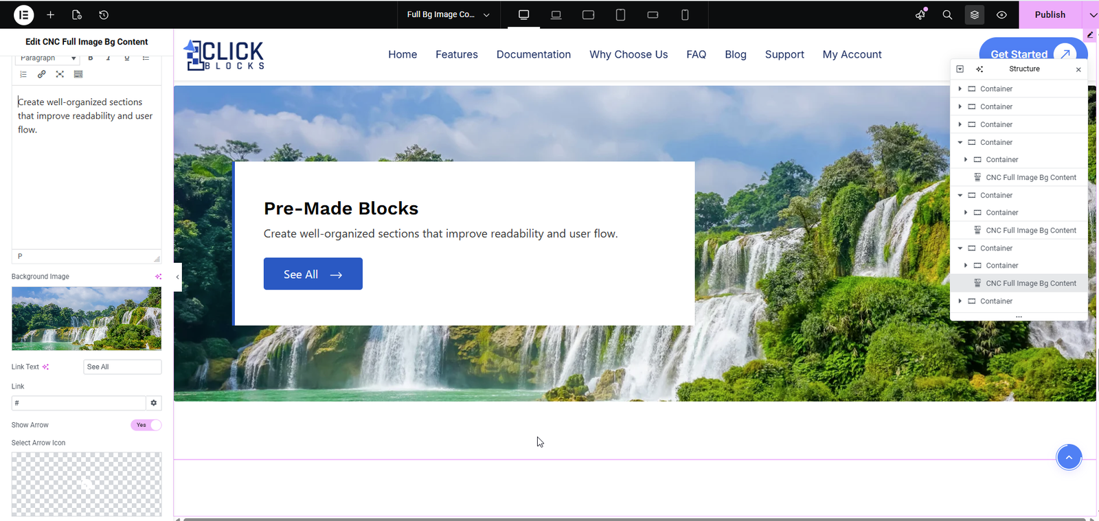
Once the widget is placed on the canvas, click on it to open the Edit Full Image Bg Content panel. Under the Content tab, you will find the following settings and fields:
This dropdown lets you choose from 5 pre-built layout styles for the widget. Each layout presents the background image and content block in a different visual arrangement. Simply select a layout from the dropdown and the canvas will update instantly to preview the result. Available options are Layout 1, Layout 2, Layout 3, Layout 4, and Layout 5.
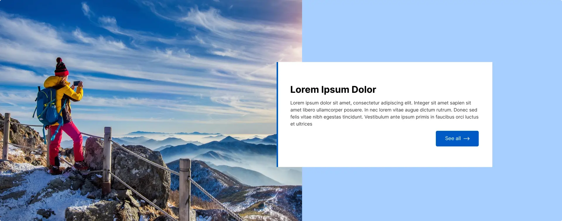
>Layout 1 — A split-panel design with the background image on the left and a bordered content box on the right.
>Layout 2 — A diagonal/angled image cut that flows into the content area for a dynamic feel.
>Layout 3 — A full-bleed dark background image (great for tech or corporate themes) with content overlaid on top.
>Layout 4 — A white card-style content block on the left with the background image occupying the right side.
>Layout 5 — A geometric pentagon-shaped image cutout on the left with the content section sitting cleanly on the right.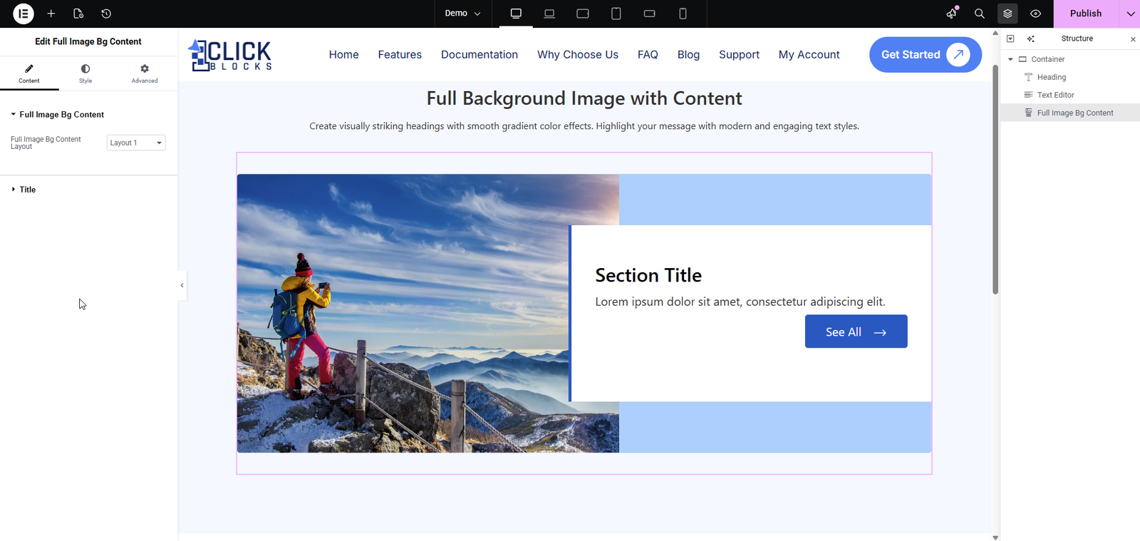
Enter the main heading text for the section. This acts as the primary title displayed over or beside the background image. By default, the field is pre-filled with Section Title. Replace it with your own relevant heading, such as Who We Are or Explore Our Services.
This is a rich text editor field where you can write a short paragraph of supporting content beneath the heading. It supports basic formatting options including bold, italic, underline, lists, and links. The default placeholder text is Lorem ipsum dolor sit amet, consectetur adipiscing elit. Replace it with your actual content.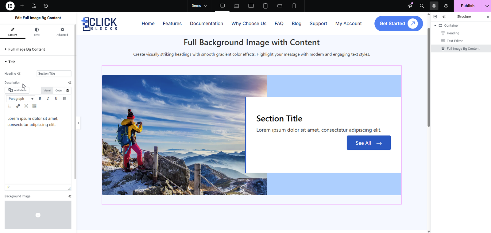
Enter the text that will appear on the call-to-action button displayed within the widget. The default button label is See All. You can customize this to match your intent, such as Learn More, Get Started, or View Portfolio.
Upload or select the image that will be used as the background (or the primary visual) for the widget. Click the Background Image upload area to open the WordPress Media Library and choose your desired image. This image is the core visual element of the widget and should be high-quality and relevant to your section content. Recommended: use a wide-format image for best results across all layouts.