The Features Widget by OneClickBlocks is a powerful Elementor widget that allows you to showcase your product or service features and benefits in a visually structured layout. Whether you want to display a simple icon grid, an interactive FAQ accordion, or an image-paired feature section, this widget gives you five ready-to-use layout options — all fully customizable directly inside the Elementor editor. It is ideal for features pages, landing pages, product pages, and service sections on any WordPress website.
Follow these steps to add the Features Widget to your Elementor page:
Step 1: Open your page in the Elementor Editor by clicking Edit with Elementor from your WordPress dashboard.
Step 2: In the left panel, click on the Elements panel search bar and type fe or features to search for the widget.
Step 3: Locate the widget named Features under the OneClickBlocks widget group in the search results.
Step 4: Drag and drop the Features widget into the desired section or container on your page canvas.
Step 5: The widget will load instantly with Layout 1 as the default, and the left panel will switch to the Edit Features settings panel where you can begin configuring your content.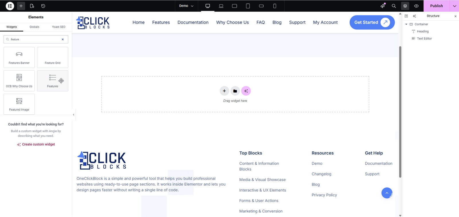
All content settings are available under the Content tab in the Elementor left panel after placing the widget. Below is a full breakdown of every setting and section available.
A dropdown selector that lets you choose from five different layout styles for displaying your features. Each layout changes the entire visual structure of the widget on the canvas in real time. The available options are: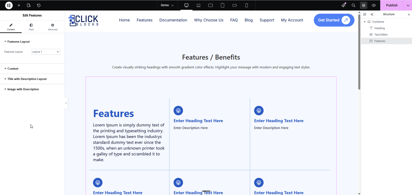
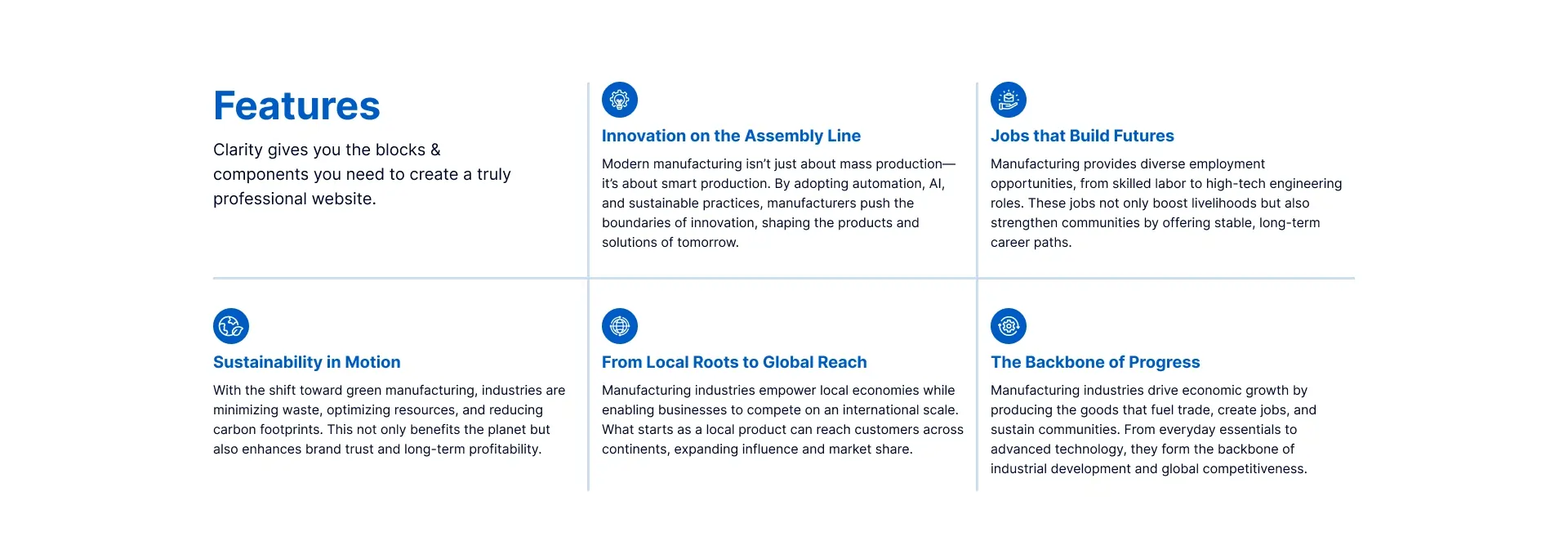
Layout 1 — A two-column grid layout with a heading and description on the left, and a 3×2 icon grid of feature cards on the right. Each card shows an icon, a heading, and a short description.
Layout 2 — A two-column layout combining a title and description on the left with a FAQ accordion list on the right. FAQ items can be expanded to reveal full descriptions. A faint icon watermark appears in the background of the left column.
Layout 3 — A horizontal card carousel/slider layout with centered heading and description at the top, left/right navigation arrows, and horizontally scrollable feature cards. The active card is highlighted in solid blue.
Layout 4 — A two-panel layout with a numbered FAQ accordion on the left and a large image with overlay text on the right, plus a floating icon badge overlapping both panels.
Layout 5 — A left-column title and description paired with a large-card horizontal slider on the right. Cards feature large icons, bold headings, and descriptions, with the active card highlighted in solid blue.
This collapsible section contains top-level content settings for the widget. Expand it to access the fields below.
This section controls the main heading and introductory description that appears in the widget — typically displayed in the left column or at the top of the layout depending on the selected Features Layout.
A toggle switch that allows you to show or hide the entire title and description block. When enabled (shown in pink/active state), the heading and description are visible on the canvas. When disabled, they are hidden from the front end. This is useful when you want to display only the feature cards without an introductory heading.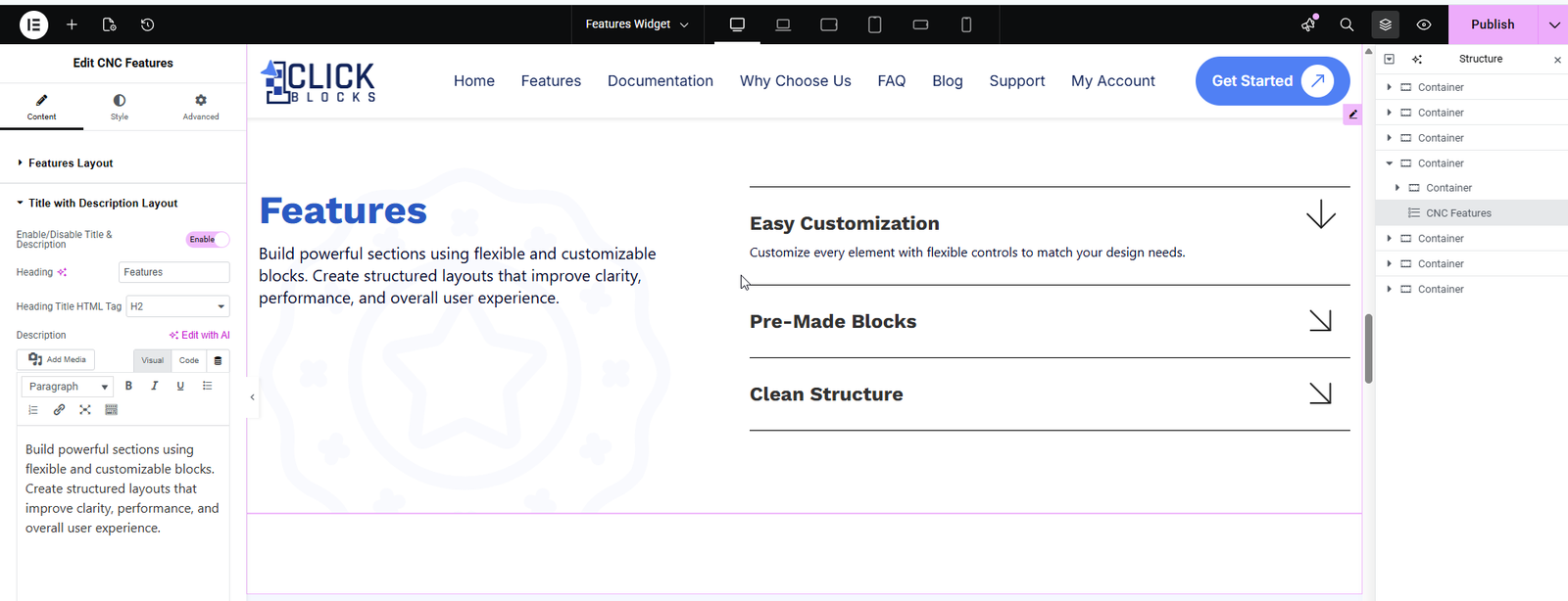
A text input field for the main heading of the features section. Enter the title you want to display, such as Features, Why Choose Us, or Our Key Benefits. This heading is rendered prominently in the layout.
A dropdown that sets the HTML tag used to render the heading. Options typically include H1, H2, H3, H4, H5, H6, and div. The default is set to H2. Choose the appropriate tag based on your page’s heading hierarchy for proper SEO structure.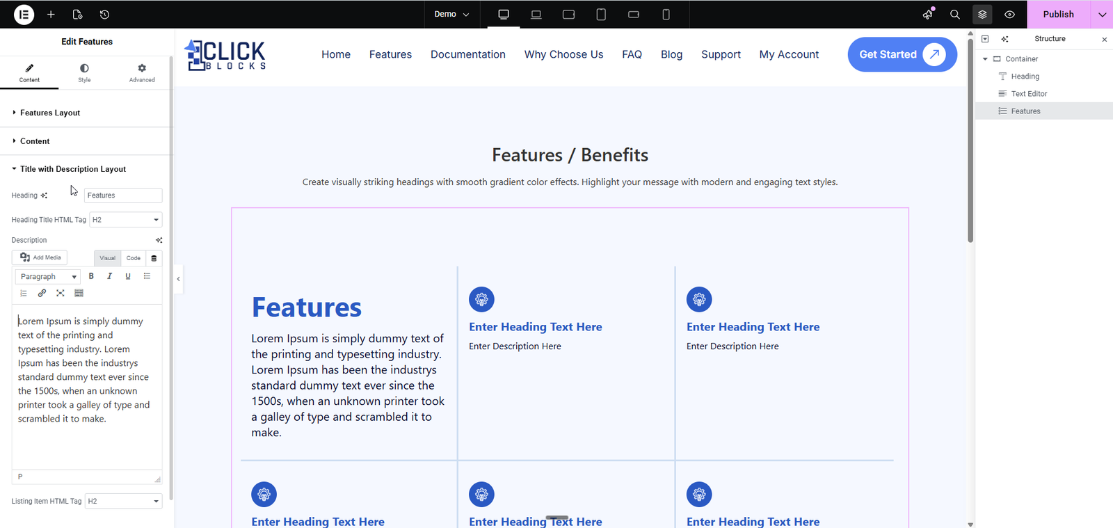
A full WYSIWYG rich-text editor (with Visual and Code views) where you can enter the introductory paragraph for the features section. This supports standard text formatting including bold, italic, underline, lists, and links. The content entered here appears below the heading in the layout.
This section manages the individual feature cards displayed in the icon grid or carousel. Each item in this section represents one feature card on the canvas. This section is available in Layouts 1, 3, and 5.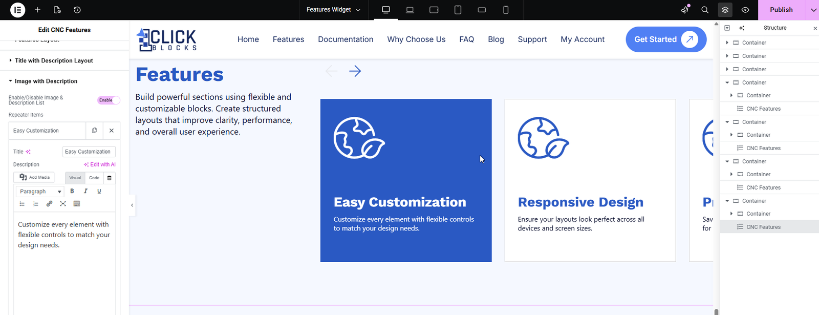
A repeatable item list where each entry corresponds to one feature card in the layout. By default, several placeholder items are pre-loaded. You can edit each item, reorder them by dragging, or remove them using the × button. Click + Add Item at the bottom to add a new feature card.
A text input field inside each repeater item for the feature card heading. Enter a short, descriptive title for the feature, such as Fast Performance or Easy Integration. This text is displayed as the card’s main label on the canvas.
A WYSIWYG rich-text editor inside each repeater item for the feature card description. Enter a brief explanation of the feature. This text appears below the title on each individual feature card.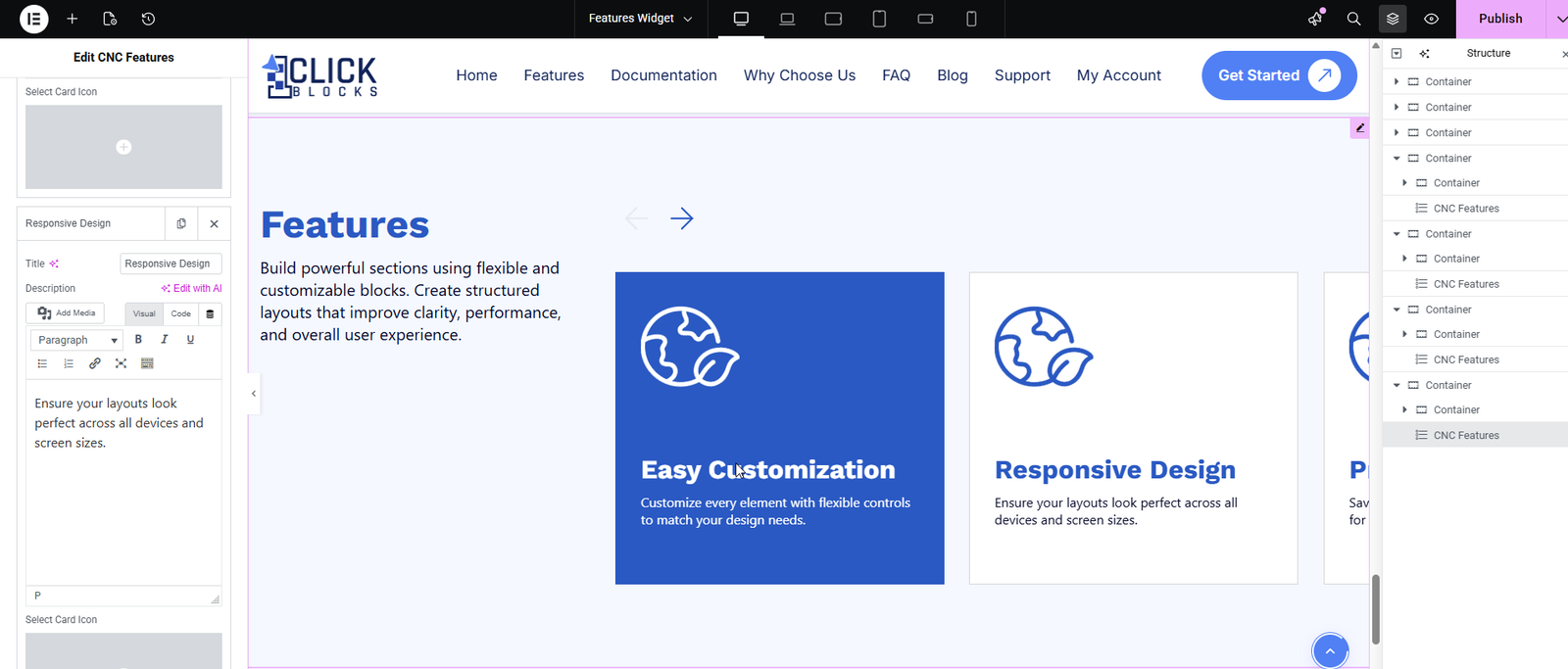
An icon picker inside each repeater item that allows you to choose an arrow or directional icon to display on the feature card. A visual preview of the selected icon is shown in the panel. This is used in layouts that display an arrow indicator on the card, such as Layout 2.
This section is available when Layout 2 or Layout 4 is selected. It controls the accordion-style FAQ items displayed on the right side of the layout.
A toggle switch that shows or hides the entire FAQ accordion column. When enabled (shown in pink/active), the FAQ items are visible on the canvas. Disable this toggle if you want to hide the FAQ section and display only the title and description side of the layout.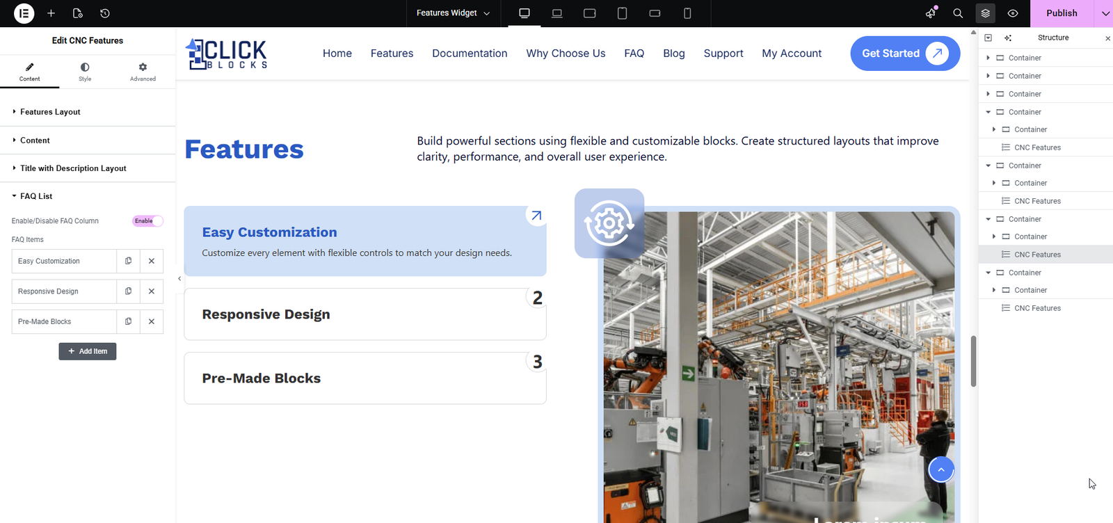
A repeatable item list where each entry is one FAQ accordion item. Each item includes a Title field for the question and an expandable Description field for the answer. By default, three placeholder FAQ Title items are pre-loaded. Click + Add Item to add more accordion entries. Each item can be deleted using the × button or reordered by dragging.