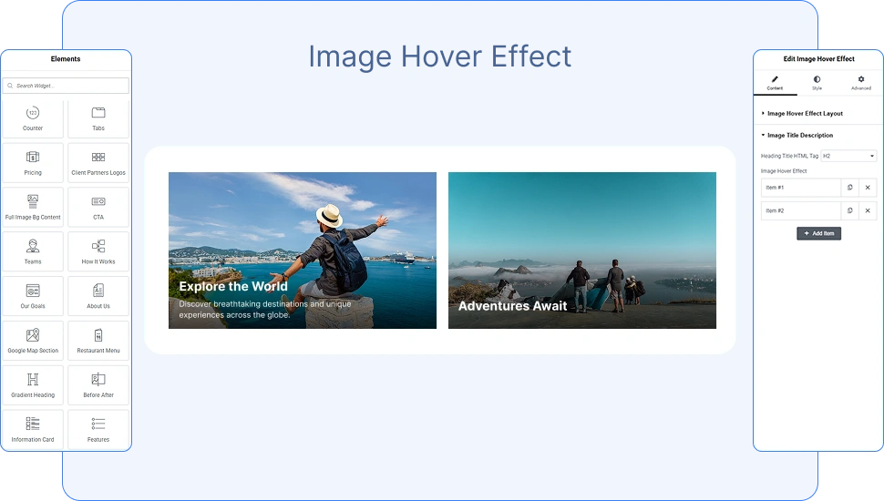
The OneClickBlocks Image Hover Effect Widget is a powerful and flexible Elementor widget that lets you display images with engaging hover animations, overlay titles, and descriptions — all without writing a single line of code. Whether you are building a portfolio, a services section, or a visual showcase, this widget gives you multiple ready-made layout styles to present your images in a visually striking and interactive way. It is fully responsive and works seamlessly across all screen sizes and devices.
Before using the Image Hover Effect Widget in Elementor, you need to activate it from your WordPress dashboard. Follow these steps:
>Go to your WordPress Dashboard.
>In the left sidebar, navigate to OneClickBlocks → Elements.
>Find Image Hover Effect in the list of available widgets.
>Toggle the switch to Enable the widget.
>Click Save Settings to apply the changes.
>Open any page or post in the Elementor Editor.
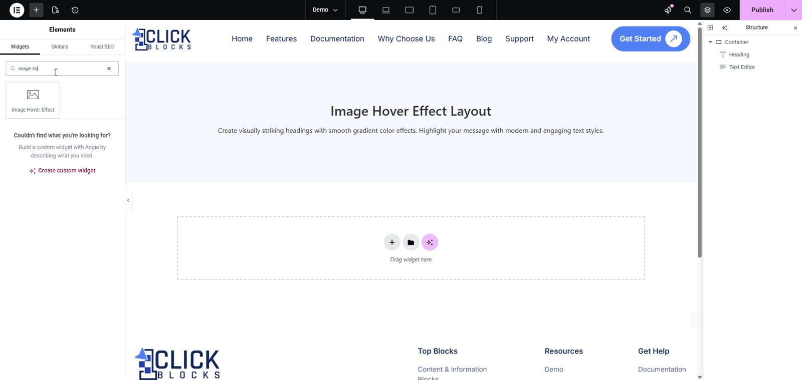
>In the left panel, search for Image Hover Effect in the widget search bar.
Drag and drop the widget into your desired container or section on the canvas.
Once the Image Hover Effect Widget is placed on the canvas, click on it to open the Edit Image Hover Effect panel on the left side of the Elementor editor. The Content tab contains two main sections: Image Hover Effect Layout and Image Title Description.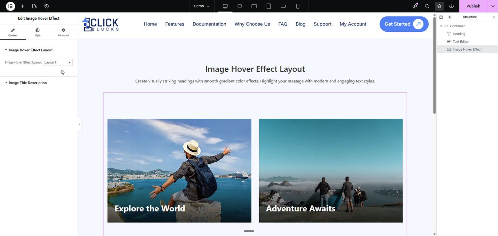
This section controls the overall visual style and structure of the hover effect cards displayed on the canvas.
A dropdown selector that lets you choose from multiple pre-designed layout styles. Each layout changes how the image, title, and description are displayed and how they animate on hover. Available options include Layout 1, Layout 2, Layout 3, Layout 4, and more. Switching layouts instantly updates the preview on the canvas so you can find the style that best fits your design.
>Layout 1 — Displays the image with the title text overlaid at the bottom of the card. Clean and minimal, ideal for travel or lifestyle imagery.
>Layout 2 — A variation with alternative image card styling and hover transition effects.
>Layout 3 — Shows both a title and a short description overlaid on the image, making it ideal for content-rich cards such as technology or editorial showcases.
>Layout 4 — Centers the title text at the bottom of the image, suitable for food, fashion, or product-focused designs.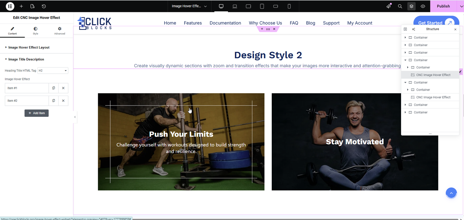
This section allows you to configure the heading tag and manage individual image items — each item represents one hover effect card displayed on the canvas.
A dropdown that sets the HTML heading tag used for the title of each image card. The default value is H2. You can change this to H3, H4, or other heading levels depending on your page’s content hierarchy and SEO requirements.
This is a repeater field that allows you to add, remove, and manage multiple image hover cards. Each item (e.g., Item #1, Item #2) represents one card in the layout. You can use the duplicate icon to copy an item or the delete icon to remove it. Click the Add Item button at the bottom of the repeater to add more cards to your layout.
Each individual item inside the repeater contains the following fields: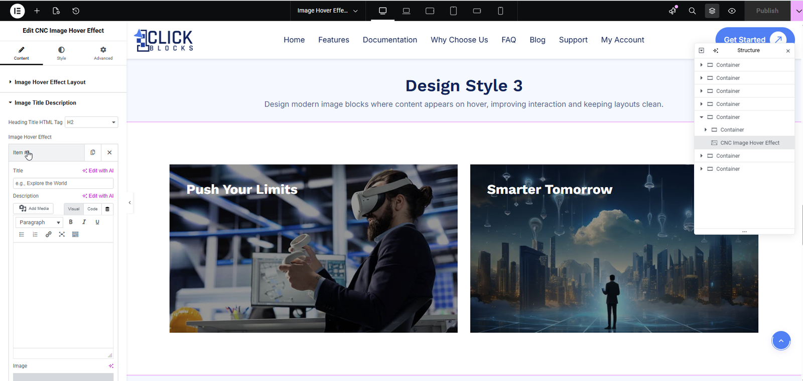
A text input field where you enter the heading or label for the image card. This title is displayed directly on top of the image, typically at the bottom or center depending on the selected layout. Example: Explore the World, Push Your Limits, or Smarter Tomorrow.
A rich text editor (WYSIWYG) where you can add a short supporting text or subtitle for the image card. This field supports basic formatting options including Bold, Italic, Underline, links, lists, and media. The description is typically revealed on hover depending on the layout style selected. This field is most visible in layouts like Layout 3 where the description appears below the title on hover.
An image upload field that lets you choose the background image for each hover effect card. Click the field to open the WordPress Media Library where you can upload a new image or select an existing one. For best results, use high-resolution images with a consistent aspect ratio across all items in the repeater.
A URL input field where you can add a clickable link to each image