
The OneClickBlocks Gradient Heading Widget is a powerful Elementor widget that lets you create visually striking, multi-color gradient headings on any page — no coding required. With multiple pre-built layout presets and full control over gradient type, colors, angle, and alignment, you can design bold and modern headings that instantly capture attention. Whether you prefer a smooth linear, radial, or conic gradient, this widget gives you the flexibility to match any brand style. It is ideal for hero sections, feature highlights, landing pages, and anywhere a standard heading simply is not enough.
Go to your WordPress Dashboard and navigate to OneClickBlocks → Elements. Find the Gradient Heading Widget, toggle it to Enable, and click Save Settings.
Next, open any page in the Elementor Editor. In the left panel, search for “Gradient Heading” in the widget search bar, then drag and drop it onto your page canvas. The Edit Gradient Heading panel will open on the left with three tabs — Content, Style, and Advanced.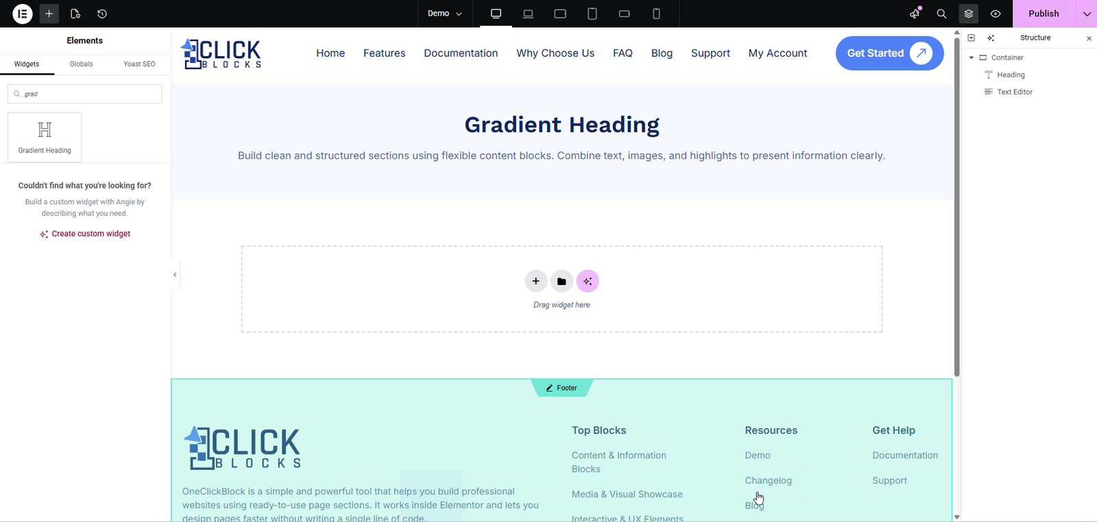
Use the Gradient Heading Layout dropdown to choose from multiple pre-built layout presets — Layout 1 through Layout 5. Each preset applies a different combination of gradient colors and background style instantly. Switching layouts updates the live preview on the canvas in real time. You can then fine-tune any layout further using the Style tab.
Enter the heading text you want to display on the page. This is the main text field that receives the gradient color styling. Replace the default placeholder Gradient Heading with your own copy, such as Welcome to Our Store or Build Something Amazing.
Choose the HTML heading tag used to render the heading in the page source. Options include H1, H2, H3, H4, H5, and H6. The default is H2. Select the correct tag for your page hierarchy — use H1 only for the primary page title and lower tags for section headings — as this directly impacts SEO and accessibility.
Opens the standard Elementor Typography control where you can set the heading’s font family, font size, font weight, line height, letter spacing, and text transform. Click the pencil icon to expand the full typography panel and customise every aspect of the heading’s typeface.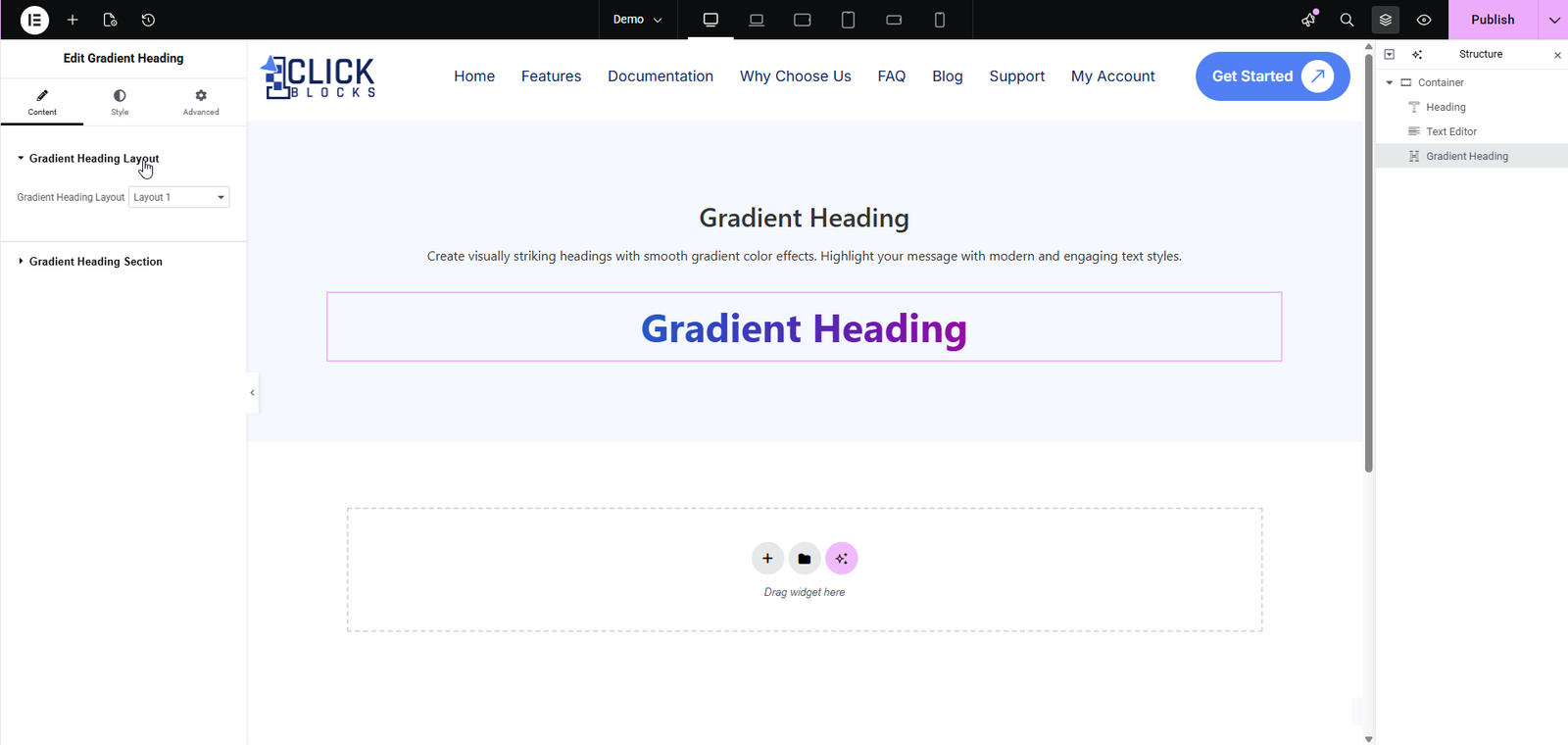
Sets the color of any decorative element associated with the heading, such as an underline or border accent. Click the color swatch to open the color picker and choose your preferred color. You can also select the clear (transparent) option to remove any decoration color entirely.
A dropdown that defines what type of CSS gradient is applied to the heading text. The three available options are:
>Linear — Colors transition in a straight line at a defined angle. This is the default and most commonly used gradient type.
>Radial — Colors radiate outward from a central point, creating a circular or elliptical gradient effect.
>Conic — Colors rotate around a central point, producing a cone-like or color-wheel style gradient.
Changing the gradient type will reveal additional relevant controls such as Angle, Starting Angle, or Position (Center of Rotation).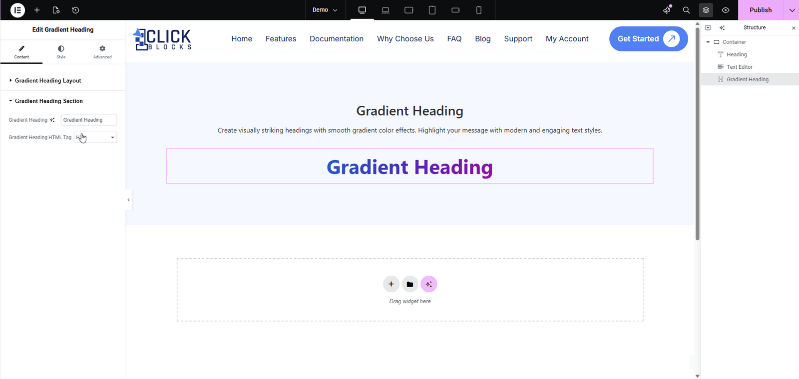
Available when Gradient Type is set to Linear. Controls the direction of the gradient in degrees. A value of 0 creates a top-to-bottom gradient, while 90 creates a left-to-right gradient. You can enter any value between 0 and 360 to achieve the exact direction you need.