
The OneClickBlocks Contact Us Widget is a powerful and flexible Elementor widget designed to help you create professional, fully customizable contact sections on your WordPress website. With five pre-built layout variations, interactive Google Maps integration, and detailed contact information cards, this widget makes it easy for visitors to get in touch with your business — no coding required. Whether you run a small agency, a local store, or a corporate website, the Contact Us Widget gives you the tools to display your location, office hours, phone numbers, and email in a visually appealing and responsive format.
Go to your WordPress Dashboard and navigate to OneClickBlocks → Elements. Find the Contact Us Widget, toggle it to Enable, and click Save Settings. Once activated, the widget will appear in the Elementor widget panel under the Widgets tab. You can search for it by typing “contact” in the search bar, or find it by scrolling through the widget categories.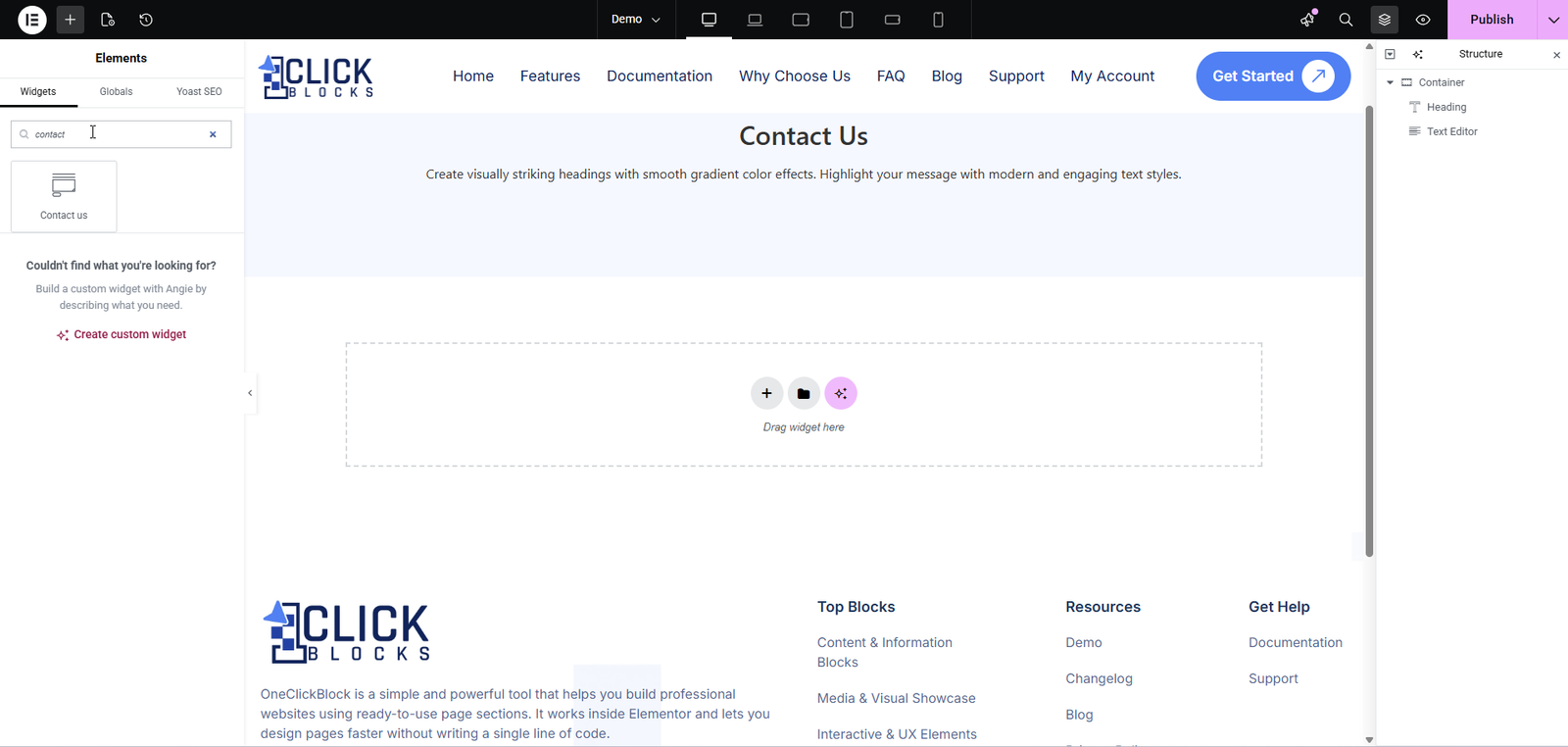
After adding the Contact Us Widget to your page, you’ll see the editing panel on the left side of the Elementor editor. The Content tab contains the following sections:
Use the Select Layout dropdown to choose from five pre-designed layout styles (Layout 1 through Layout 5). Each layout offers a unique arrangement of contact information, maps, and images to suit different page designs.
Control the visibility of the left and right columns within the widget.
Show Left Column — Toggle this switch to show or hide the left column of the widget layout.
Show Right Column — Toggle this switch to show or hide the right column of the widget layout.
Configure the main heading and description that appears at the top of the contact section.
Contact Us — Enter the main heading text for the contact section. The default value is Contact Us.
Heading Tag — Choose the HTML heading tag for the title (e.g., H1, H2, H3, etc.). The default is H2.
Section Description — Add a short description or tagline below the heading. The default text reads Clarity gives you the blocks & components you need to create a truly professional website.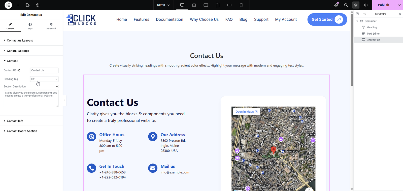
Manage the individual contact information cards displayed within the widget.
Info Card Heading Tag — Set the HTML heading tag for each contact info card title. The default is H3.
Contact Information List — A repeater list of contact items. By default, four items are included: Office Hours, Our Address, Get In Touch, and Mail Us. Each item can be edited or removed, and new items can be added using the + Add Item button.
For each contact item, the following fields are available:
Title — The heading for the contact item (e.g., Office Hours).
Icon — Select an icon to represent the contact item using the built-in icon picker.
Text — A rich text editor where you can add the contact details (e.g., Monday-Friday 8:00 am to 5:00 pm). Supports Visual and Code editing modes.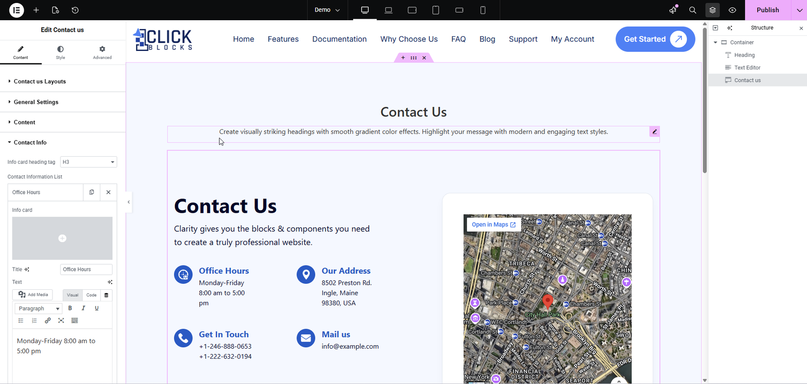
Add a map or other embedded content to the contact widget using a shortcode.
Content Type — Choose the type of content to display. Currently supports Shortcode.
Shortcode — Enter a shortcode to embed content such as a Google Map. For example, enter [coco_map] to display a Google Maps embed in the widget.
Available in certain layouts (e.g., Layout 2, Layout 3, Layout 5), this section allows you to add a background or side image to enhance the visual appeal of the contact section. Upload or select an image from your media library to display alongside the contact information and map.
Available in Layout 4, this section lets you configure the office address details displayed in the “Visit Our Office” card on the map section. Enter your business address to show it on the map with a Get Direction button.