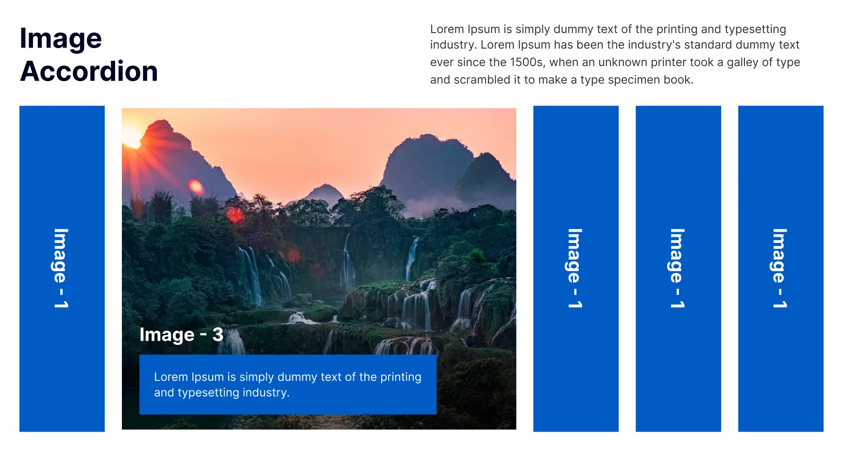
The OneClickBlocks Image Accordion Widget is a powerful Elementor widget that helps you display multiple images in an interactive, expandable accordion layout — no coding required. Whether you want to showcase portfolios, product galleries, team members, or any visual content, this widget lets you create engaging, responsive image accordions with smooth transitions and multiple pre-built layout styles. Fully customizable and designed to captivate visitors across all devices.
Go to your WordPress Dashboard and navigate to OneClickBlocks → Elements. Find the Image Accordion Widget, toggle it to Enable, and click Save Settings.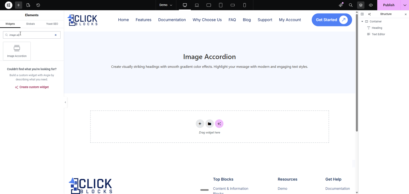
After dragging the Image Accordion widget onto your Elementor page, you will see the following settings in the left panel under the Content tab.
Use the Image Accordion Layout dropdown to choose from multiple pre-built layout styles. OneClickBlocks offers five unique layouts (Layout 1 through Layout 5), including horizontal split panels, overlapping cards, vertical list with side image, horizontal panels with rotated titles, and full-width banner style. Each layout transforms the visual presentation of your accordion instantly.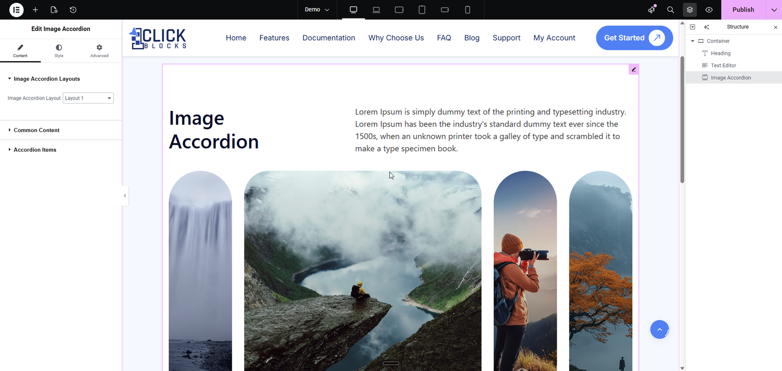
This section controls the shared content displayed across all layouts of the accordion widget.
Title — Enter the main heading text for the accordion widget (e.g., Our Gallery, Meet the Team). This title appears above the accordion items.
Title HTML Tag — Choose the semantic HTML tag for the title from the dropdown. Available options include H2, H3, H4, H5, and H6. Use this to maintain proper heading hierarchy on your page.
Description — Add a descriptive paragraph or introductory text using the built-in rich text editor. This appears below the title and provides context for the accordion content.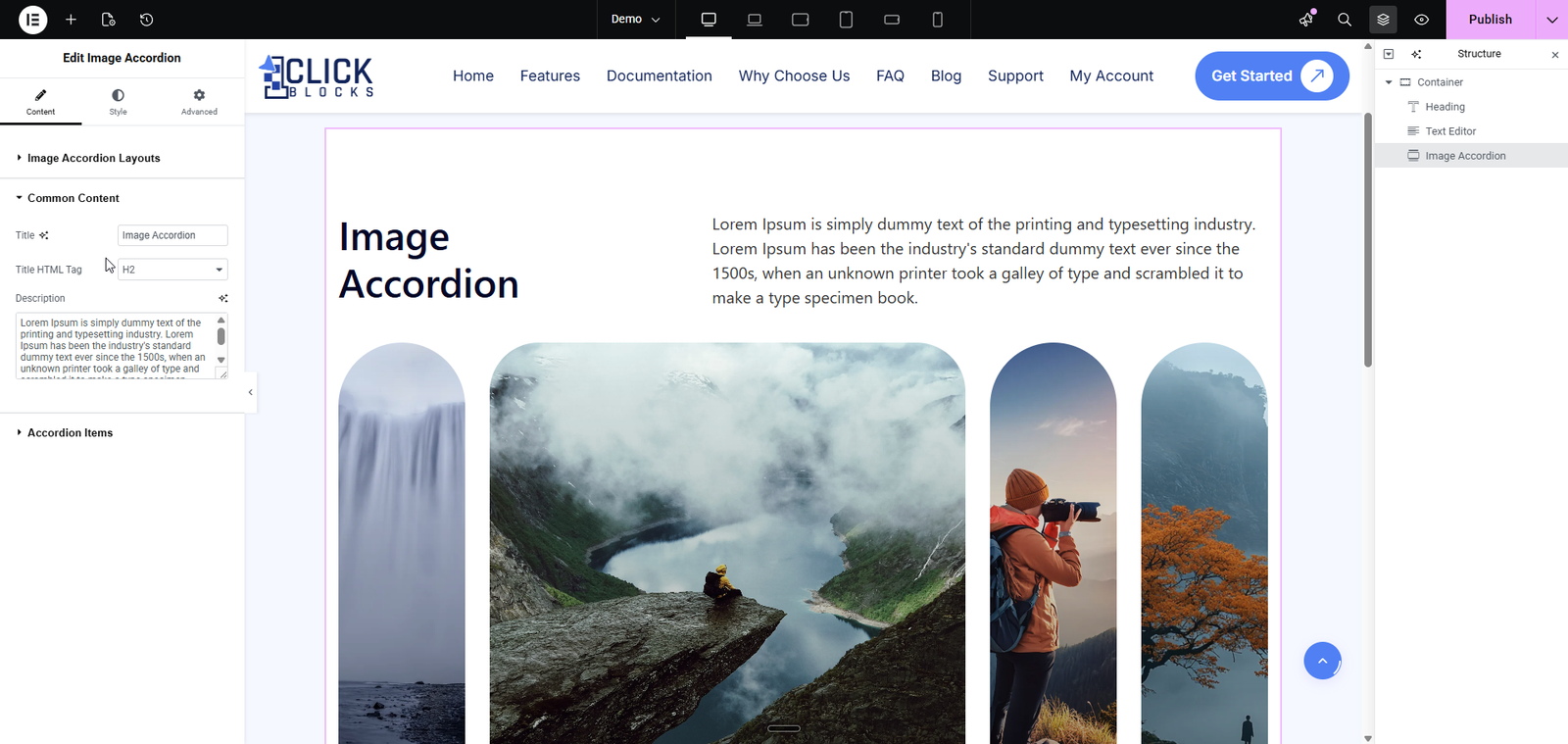
This section manages the individual accordion items that appear in the widget. You can add, edit, reorder, and remove items as needed.
Title HTML Tag — Set the HTML tag for all accordion item titles from the dropdown. Choose from H2, H3, H4, H5, or H6 to control the heading level of each item title.
Accordion Items — This is a repeater field where each accordion item contains the following sub-fields: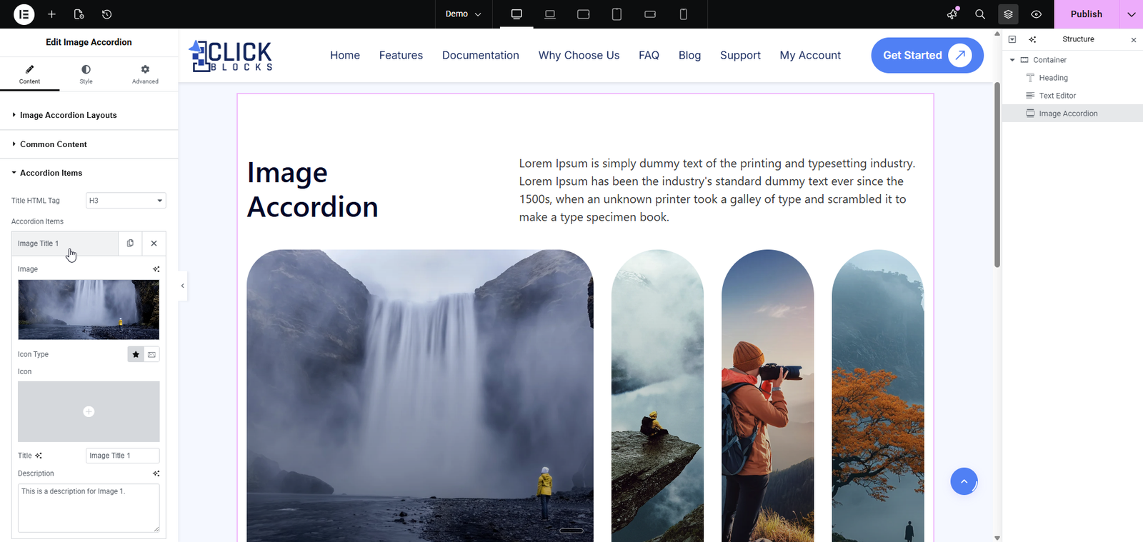
Image — Upload or select an image from the WordPress Media Library. This image represents the accordion item and is displayed in the layout panels. You can browse the media library, upload new files, or use existing images.
Icon Type — Select an icon type for the accordion item from the available options. This adds a visual icon alongside each accordion item for enhanced styling.
Icon — Choose a specific icon from the icon picker. The selected icon will be displayed with the accordion item based on the icon type chosen.
Title — Enter the title text for this accordion item (e.g., Image Title 1). This text appears as the clickable or visible label for the item in the accordion layout.
Description — Add a short description or details for this accordion item. This text is displayed when the accordion item is expanded or highlighted, providing additional context about the image.
Add Item — Click the + Add Item button to create a new accordion item. Each new item includes all the fields mentioned above (Image, Icon Type, Icon, Title, and Description).
Each accordion item also has a Settings icon (gear) to manage its position and a Delete icon (X) to remove it from the list.