The Why Choose Us widget by OneClickBlocks lets you create professional, visually engaging “Why Choose Us” sections inside Elementor — without writing a single line of code. It comes with 5 ready-made layout styles and fully customizable card items, making it ideal for showcasing your brand’s key features, services, or unique selling points. Whether you are building a landing page, homepage, or service page, this widget delivers a polished, conversion-focused section in minutes.
Follow these steps to add the Why Choose Us widget to your Elementor page:
Step 1: Open any page in Elementor by clicking Edit with Elementor from your WordPress dashboard.
Step 2: In the left-side Elementor panel, click the Elements (Widgets) tab and use the Search Widget field to search for Why Choose Us.
Step 3: Drag the Why Choose Us widget from the panel and drop it into any container or section on the canvas.
Step 4: The widget will be placed instantly and the left panel will switch to the Edit Why Choose Us settings panel, where you can configure all content and layout options.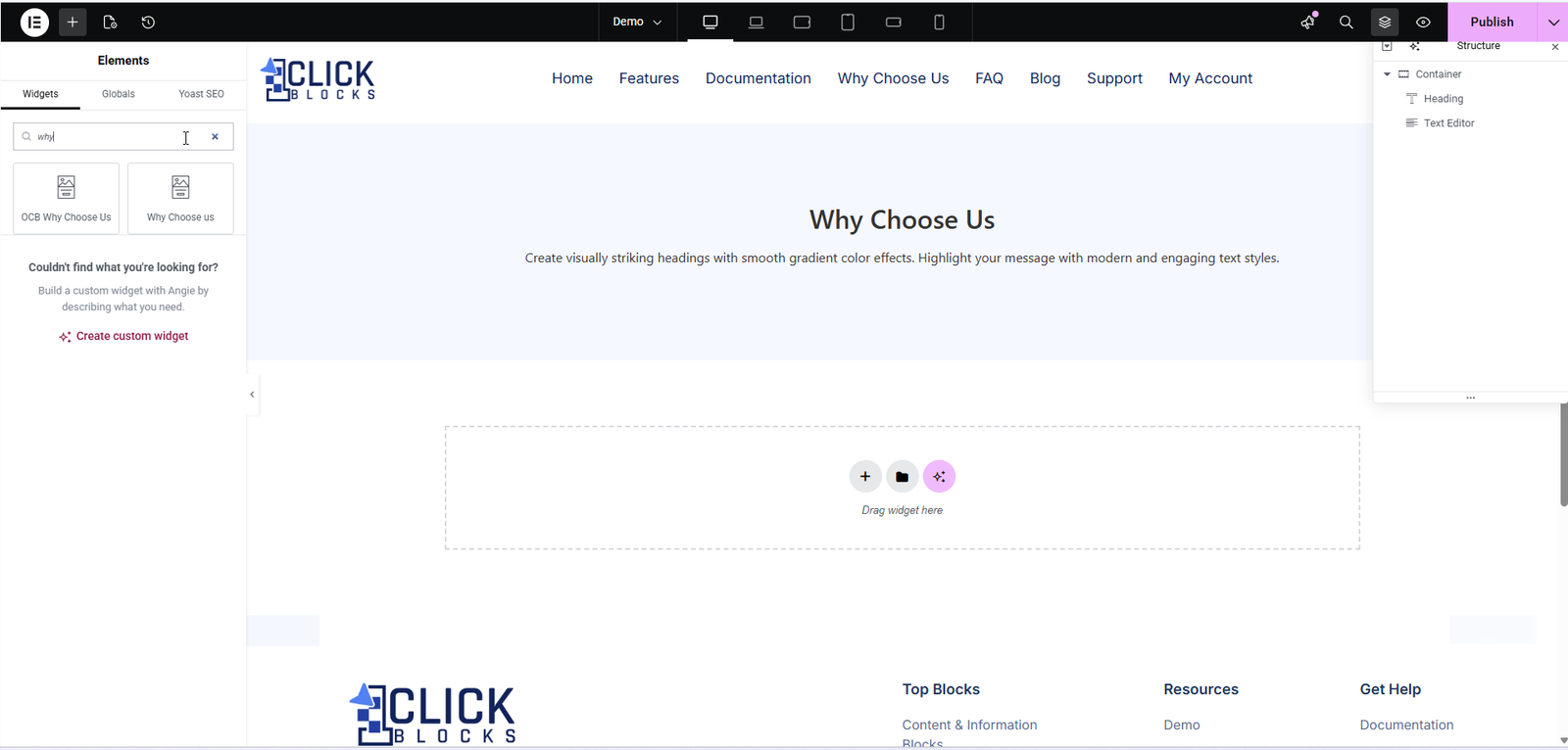
All content configuration for the Why Choose Us widget is available under the Content tab in the Elementor left panel. The settings are grouped into three sections: Why Choose Us Layout, Section Heading, and Cards.
This dropdown controls the overall visual style of the widget. There are 5 layout options available, each offering a distinct design suitable for different use cases:
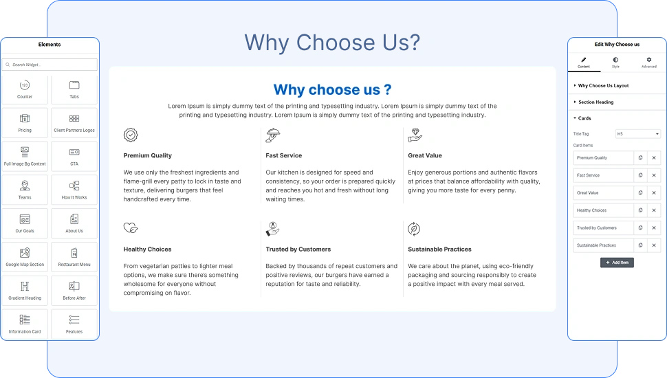
Layout 1 — A clean 3-column grid with cards displayed side by side. Each card shows an icon at the top, followed by a title and short description. Best suited for simple feature showcases.
Layout 2 — A vertical list style where each card stacks beneath the previous one. Icons are displayed as large colored circles. Ideal for step-by-step or detailed feature breakdowns.
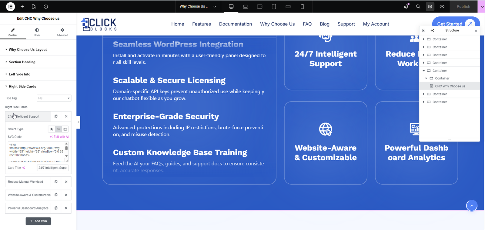
Layout 3 — A split two-column layout with a bold blue background. The left side contains detailed text-based feature descriptions (Left Side Info), and the right side shows icon cards in a grid (Right Side Cards). Best for SaaS or product feature pages.
Layout 4 — A compact icon-list grid showing items in 4 columns with a small circular icon beside each card title. Suitable for displaying a large number of features in minimal space.
Layout 5 — A blue tiled card grid (3 columns × 2 rows) where each card contains a bold title, description text, and an integrated icon on the right side of the card. Great for bold, high-impact sections.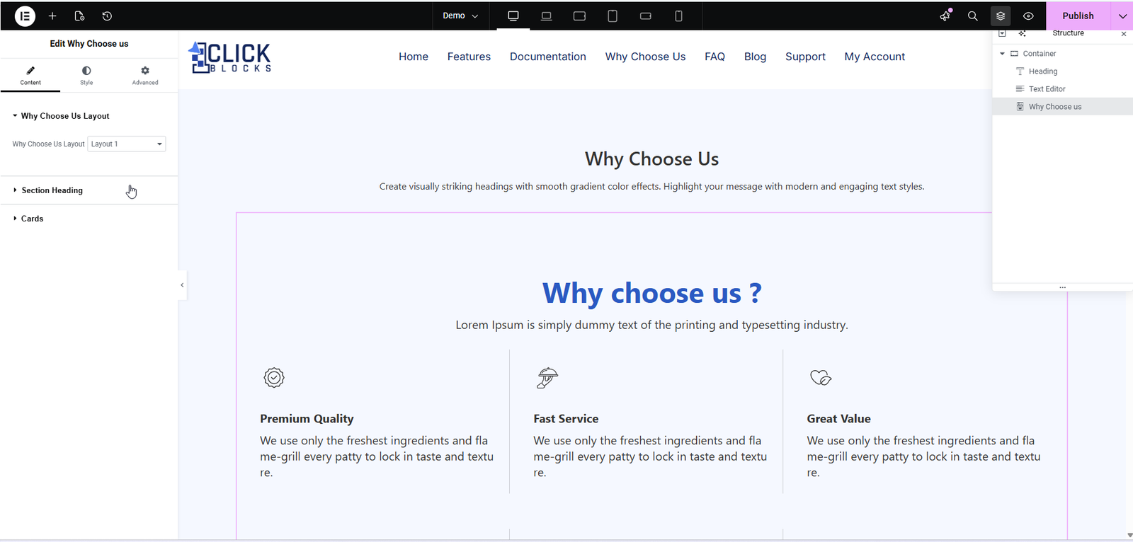
This section controls the main heading and subheading displayed at the top of the widget, above the cards. You can set your section title (e.g., Why Choose Us?) and a short supporting description (e.g., Lorem Ipsum is simply dummy text of the printing and typesetting industry.). These fields help introduce the section to your visitors.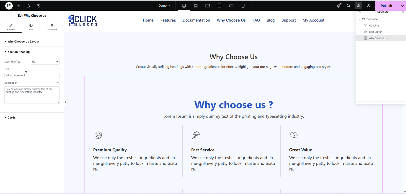
The Cards section controls all the individual feature cards displayed inside the widget. The following settings are available:
This dropdown sets the HTML heading tag used for each card’s title. The default is set to H5. You can change this to match your page’s heading hierarchy (e.g., H3, H4, H6). Choosing the correct heading tag is important for SEO and accessibility.
This is a repeater field that lists all the individual cards displayed in the widget. Each item in the list represents one card on the canvas. By default, the widget includes the following cards:
Premium Quality, Fast Service, Great Value, Healthy Choices, Trusted by Customers, Sustainable Practices.
Each card item can be edited individually by clicking the pencil/edit icon next to it, or removed by clicking the × (delete) icon. You can also reorder cards by dragging them up or down within the list.
Click the + Add Item button at the bottom of the Cards list to insert a new card into the widget. This allows you to add as many feature cards as needed for your page.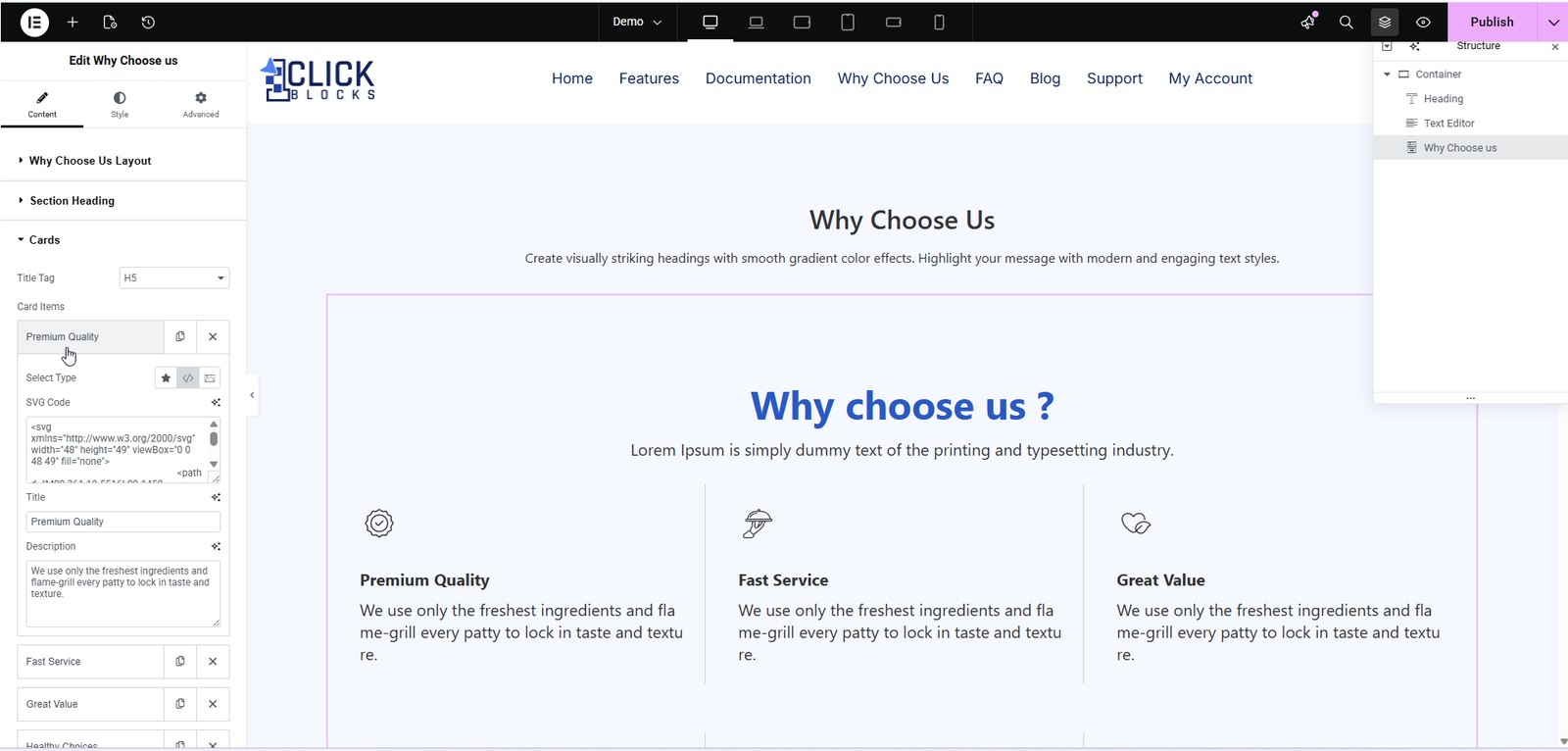
When Layout 3 is selected, an additional Left Side Info section appears in the panel. This section controls the detailed feature descriptions displayed on the left half of the split layout. Each item typically includes a feature title and supporting description text (e.g., Seamless WordPress Integration, Scalable & Secure Licensing, Enterprise-Grade Security).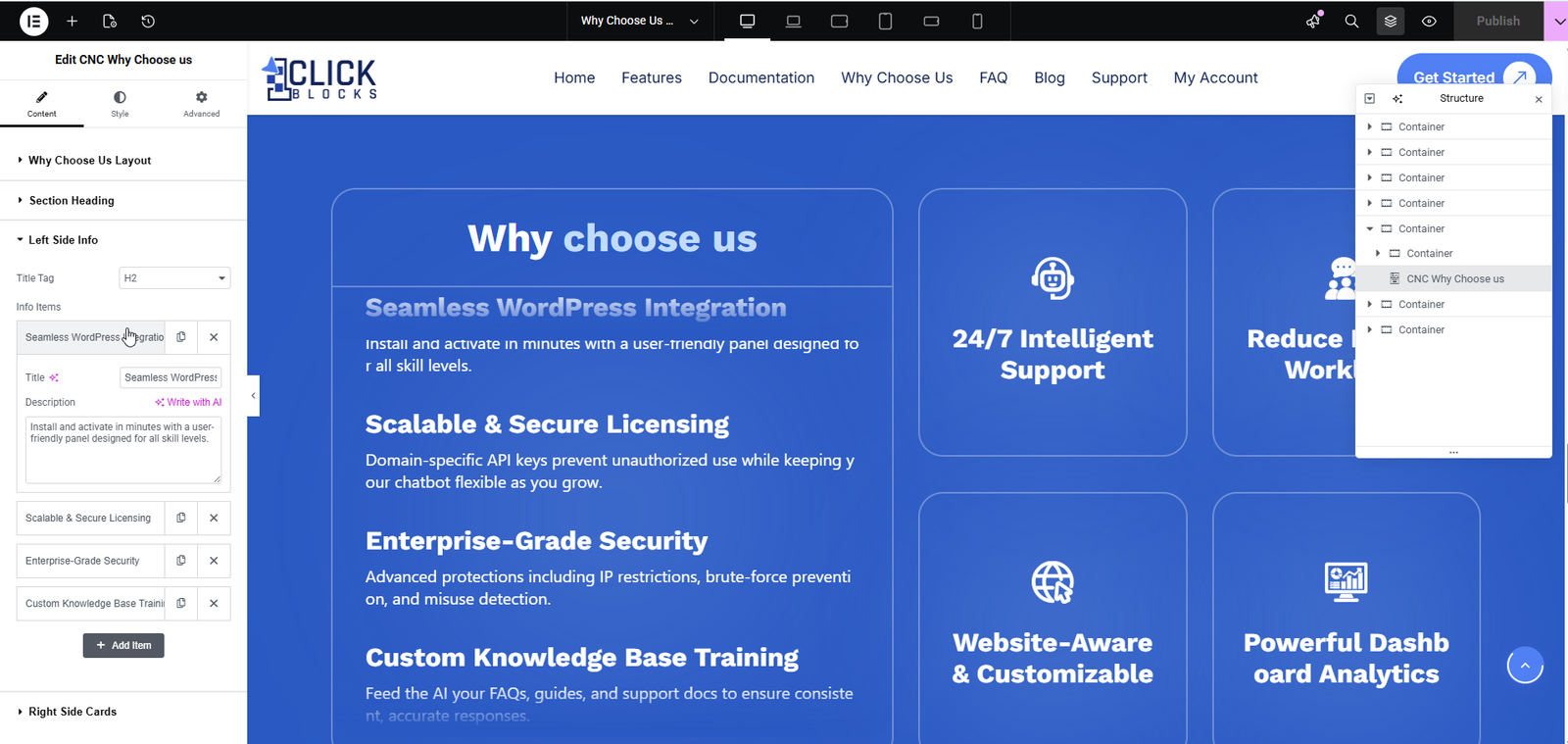
When Layout 3 is selected, a Right Side Cards section also appears. This controls the icon cards displayed on the right panel of the split layout. Items here are displayed as icon-only tiles with a label (e.g., 24/7 Intelligent Support, Website-Aware & Customizable, Powerful Dashboard Analytics).