The Tabs widget from OneClickBlocks is a powerful and flexible Elementor widget designed to organize and display content in a clean, structured tabbed layout. Whether you want to showcase services, features, FAQs, or product details, this widget lets you present information in a user-friendly format with multiple layout options to choose from. With intuitive content controls and multiple visual styles, the Tabs widget helps you create engaging and interactive sections on your Elementor-built pages.
Follow these simple steps to add the Tabs widget to your Elementor page:
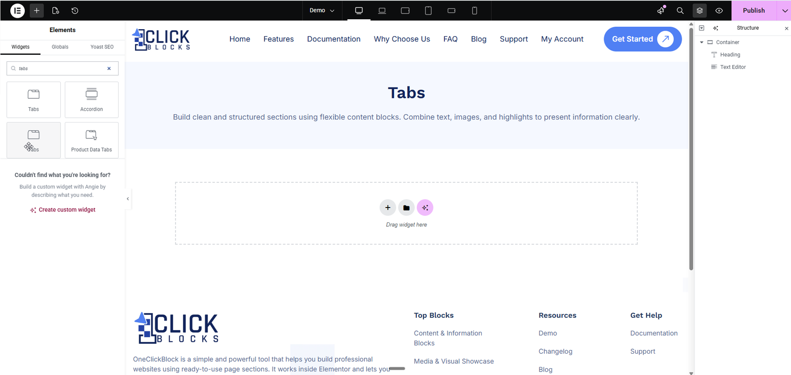
Step 1: Open the page you want to edit using the Elementor page builder.
Step 2: In the left sidebar, click on the Elements tab and use the search bar to search for “Tabs”.
Step 3: Locate the Tabs widget under the OneClickBlocks section.
Step 4: Drag and drop the Tabs widget onto your desired area on the page canvas.
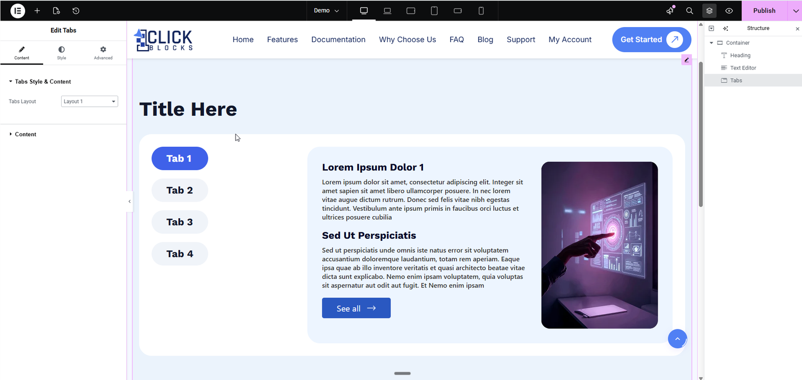
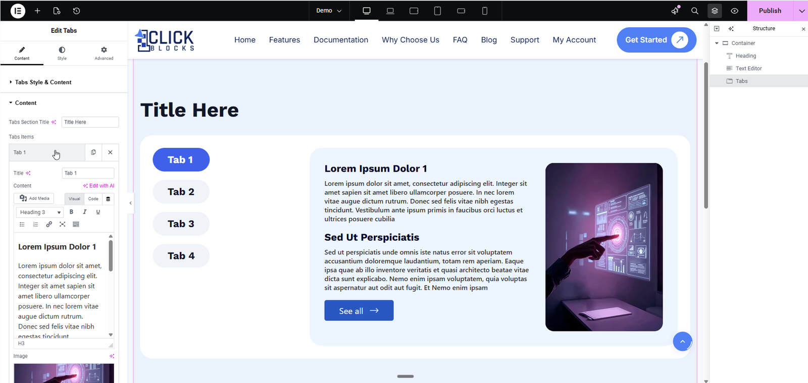
Step 5: The widget will appear with default content. Click on the widget to open the editing panel on the left.
This section controls the overall structure and layout of the Tabs widget.
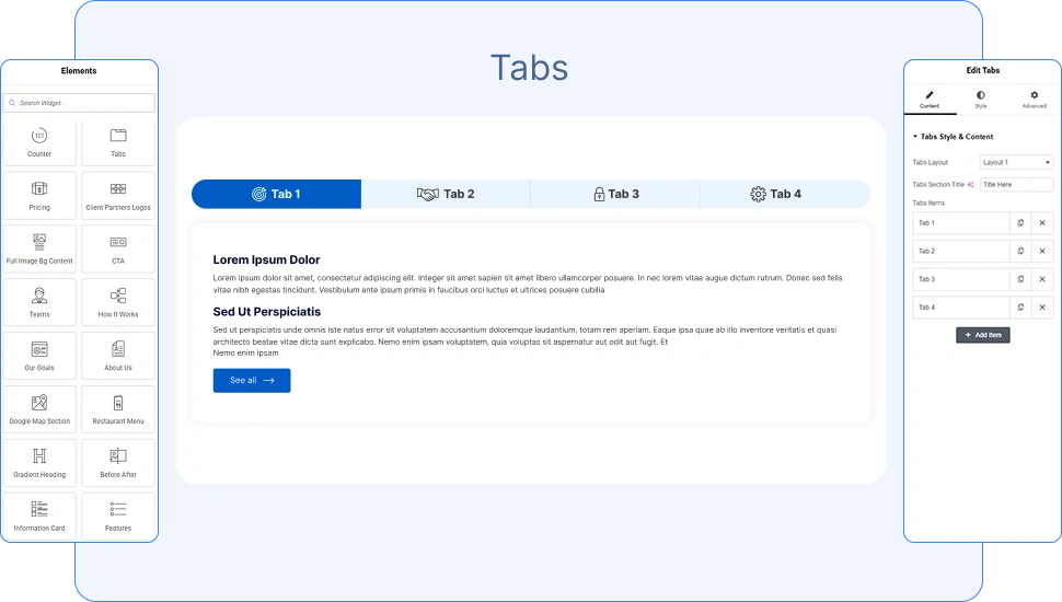
Choose from multiple pre-designed layouts for your tabs. The available layouts are:
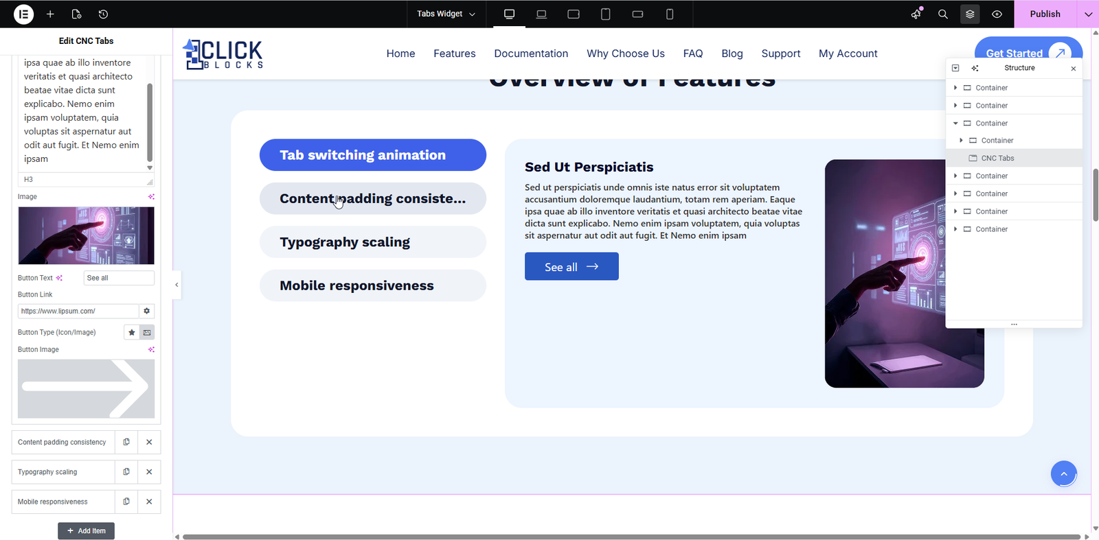
Layout 1: Vertical tabs on the left side with content preview on the right, including a heading, text, and optional image.
Layout 2: Card-style vertical tabs with each tab displayed as a distinct card on the left side.
Layout 3: Horizontal tabs with icons positioned above each tab name.
Layout 4: Three-column horizontal layout with tabs at the top, a left content column, a center image area, and a right text block column.
Layout 5: Horizontal tabs with a pointer icon on the active tab and content displayed below with an optional right-side illustration image.
This section allows you to manage all tab items and their individual content.
A repeater section where you can add, edit, reorder, or delete individual tab items. Each tab item includes the following fields:
Enter the name or label for the tab. This text appears as the tab heading. For example, use values like Tab 1 or Services.
Upload or select an icon or image to display alongside the tab title. This is useful for layouts that show icons next to each tab name.
Select a thumbnail image that represents the tab visually. This appears in layouts where tabs include image previews.
Add an optional heading that appears above the main tab content area. For example, enter Tab service to display a subheading before the main content.
Enter the main content for the tab using the rich text editor. You can add text, headings, links, lists, and other formatting. The editor supports both Visual and Code modes. You can also use the Edit with AI option to generate content automatically.